Okay, real talk—I used to think mixing floral prints on bedding was basically a recipe for visual chaos. Like, wouldn’t all those flowers just clash and make your bedroom look like a botanical explosion? 🙂 Turns out, I was totally wrong. When you know the actual rules for pairing florals, you unlock this incredible ability to create bedding that looks intentional, cohesive, and honestly? Really freaking beautiful.
The secret isn’t rocket science. You just need three core principles: match your colors, vary your pattern scales, and balance bold florals with complementary patterns. Do that, and suddenly your bedroom transforms into a space that feels either bohemian, shabby chic, or springtime-ready—without looking like you threw darts at a fabric store.
Let me walk you through exactly how to do this right.
The Three Non-Negotiable Rules for Mixing Floral Prints
Want to know what separates a “wow, that’s gorgeous!” bedroom from one that screams “help me” the second you open your eyes? It’s sticking to these three rules. I promise they’ll change how you approach bedding forever.
Rule #1: Anchor Everything With Shared Colors
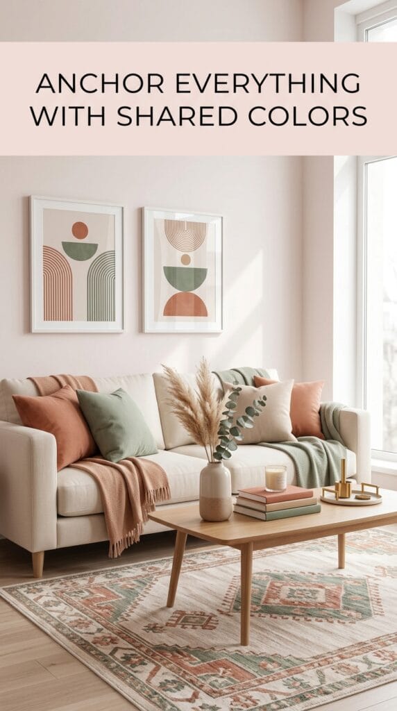
Here’s the thing about floral prints—they look chaotic, but they’re actually incredibly organized when you look closely. Every single floral pattern carries specific colors, and that’s your lifeline for creating harmony.
Here’s what you actually do: Pick one floral as your hero piece (your duvet cover, quilt, or comforter—whatever’s the star). Then, extract 2–3 dominant colors from that print. Let’s say you love this ruby red poppy duvet with apricot undertones and forest green leaves. Those become your color anchors.
Now, when you choose your matching sheets, pillows, or complementary patterns, they should echo at least one of these colors. A cream-and-red striped sheet set? Perfect match. Forest green small-scale florals? Chef’s kiss. Random navy polka dots? Nope—that breaks your color story.
Pro tip: Limit yourself to 3 colors maximum, not counting neutrals like white, black, or gray. Those act as supporting players, not leads.
Rule #2: Vary Your Pattern Scales and Sizes
Ever stood in front of your bed and felt like your eyes didn’t know where to land? That usually means you’ve got two large-scale florals fighting for attention. And yeah, that’s overwhelming—kind of like listening to two people yell at you simultaneously :/
The antidote? Mix big with small. Pair that large-scale poppy duvet with tiny florals on your sheets, or throw in polka dots for a vintage cottage vibe. When patterns compete at different scales, your brain actually relaxes because it can distinguish between them.
Here’s a breakdown of what works:
- Large-scale floral duvet + small-scale floral sheets = cozy, intentional
- Large-scale floral duvet + stripes or polka dots = crisp, classic
- Large-scale floral duvet + tartan or gingham = boho-romantic
- Mid-size floral + delicate geometric patterns = balanced, sophisticated
The pattern hierarchy prevents visual exhaustion and gives your eye something to follow naturally.
Rule #3: Balance Bold Florals With Neutrals and Complementary Prints
Bold florals are stunning, but they need grounding. Think of it like this—a vibrant print is like a spotlight on a stage. You don’t want to shine that light everywhere; you want to direct it strategically so everything looks intentional.
What does grounding look like? Pairing that crimson kilim floral with cream-and-black stripes neutralizes the intensity. The stripes don’t compete; they actually give your eye a visual “break” between all those bold petals and leaves.
You can ground bold florals with:
- Neutral striped sets (cream, white, or light gray backgrounds)
- Subtle solids that echo one color from your hero print
- Delicate geometrics like small-scale checks or pinstripes
- Textured fabrics like plain linen or cotton (more on this later)
This is where your bedroom stops looking chaotic and starts looking curated.
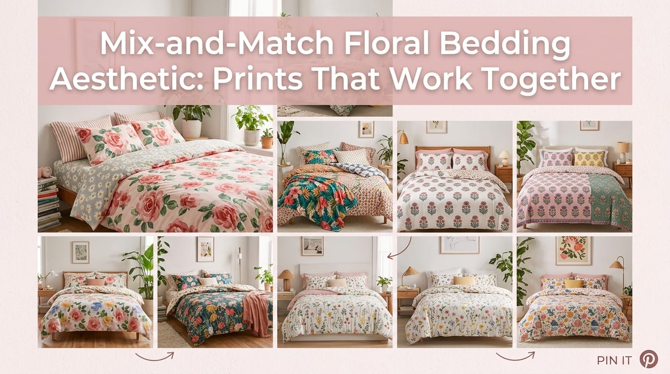
Building Your Floral Bedding Combination: Real-World Examples That Actually Work
Alright, let’s move beyond theory. Here are specific combinations that people have actually created—and they look amazing.
| Hero Floral Print | Best Matching Prints | Color Story | Aesthetic Vibe |
|---|---|---|---|
| Orange Blossom (warm vintage florals) | Pinstripes, small florals, polka dots | Burnt orange + cream + sage green | Boho cozy |
| Ruby Kilim (crimson-black intricate design) | Neutral red-cream stripes | Deep red + cream + black | Bold bohemian |
| Red Poppy (stylized ruby poppies on apricot) | Small forest-green florals | Warm apricot + red + green | Romantic vintage |
| Victorian Lilac (linen-blend mid-size florals) | Tiny florals, ruffles, or delicate patterns | Soft lilac + cream | Shabby chic elegance |
| English Gardens (blue-white crisp floral) | Blue-white stripes with ruffled edges | Navy + white | Classic cottage |
| Spring Florals (general pastels) | Gingham, pastel stripes, subtle animal prints | Soft pink + pale blue + white | Modern coquette |
My personal favorite? The Ruby Kilim with cream-and-black stripes combo. It sounds bold on paper, but in person? It’s absolutely stunning. The neutral stripes prevent the crimson from feeling aggressive, and you get this sophisticated, carefully-put-together aesthetic that somehow looks effortless.
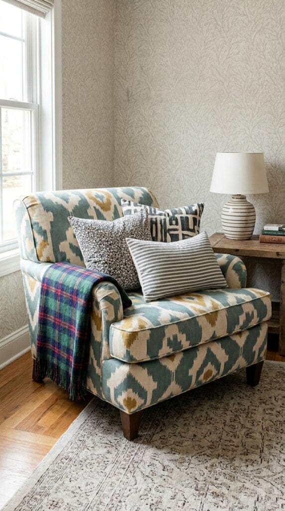
Texture: The Secret Weapon Nobody Talks About Enough
Here’s something that genuinely took me years to figure out—mixing textures is just as important as mixing prints. FYI, this is what separates a pretty bed from an incredible bed.
Pair your cotton or linen florals with silk accents, ruffles, pleated details, or even velvet throw pillows. That textural variety makes the whole setup feel intentional and expensive, even if you didn’t drop a fortune on it.
Spring bedding especially benefits from this. A pastel floral duvet with gingham pillowcases and a silk throw? That gives you those romantic coquette vibes that everyone’s going for right now. The patterns play together, sure, but the textures create visual depth that makes you actually want to look at your bed.
Texture Combinations That Work
- Cotton/linen florals + silk accent pillows = luxe bohemian
- Quilted floral duvet + smooth cotton sheets = dimensional cottage
- Floral with ruffles + solid linen pillowcases = romantic farmhouse
- Block-print florals + smooth microfiber stripes = modern boho
Honestly, don’t sleep on texture (pun absolutely intended). It’s the difference between a bed you scroll past and one that makes you want to stay in it all day.
Style-Specific Floral Pairings: Find Your Vibe
Different aesthetics need different approaches. Let me break down exactly what works for each style.
The Bohemian Approach
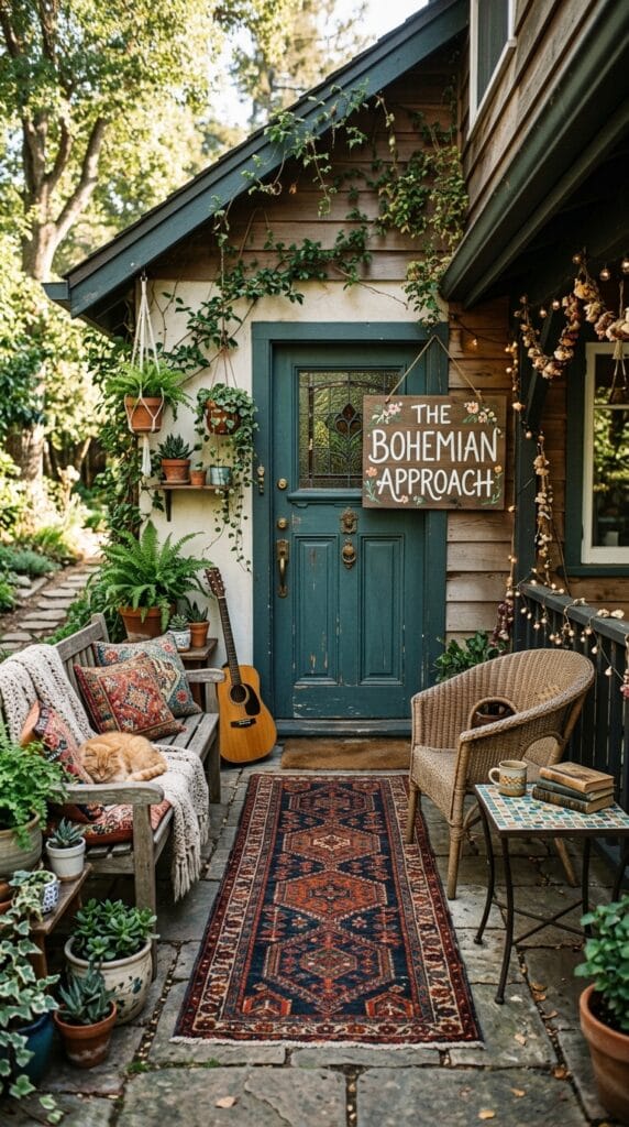
Boho is all about collected-over-time energy. You want florals that feel lived-in and intentional, not matchy-matchy.
Your hero piece: Victorian Lilac, Orange Blossom, or any mid-size floral with warm undertones.
What to pair it with: Polka dots, tiny matching florals, pinstripes in coordinating colors, or even a completely different but color-coordinated floral.
Color story: Think warm apricot, sage green, dusty rose, or burnt orange. Avoid cool grays—they clash with boho energy.
The magic here is that nothing looks coordinated, but somehow it is. That’s the boho charm.
The Shabby Chic Route
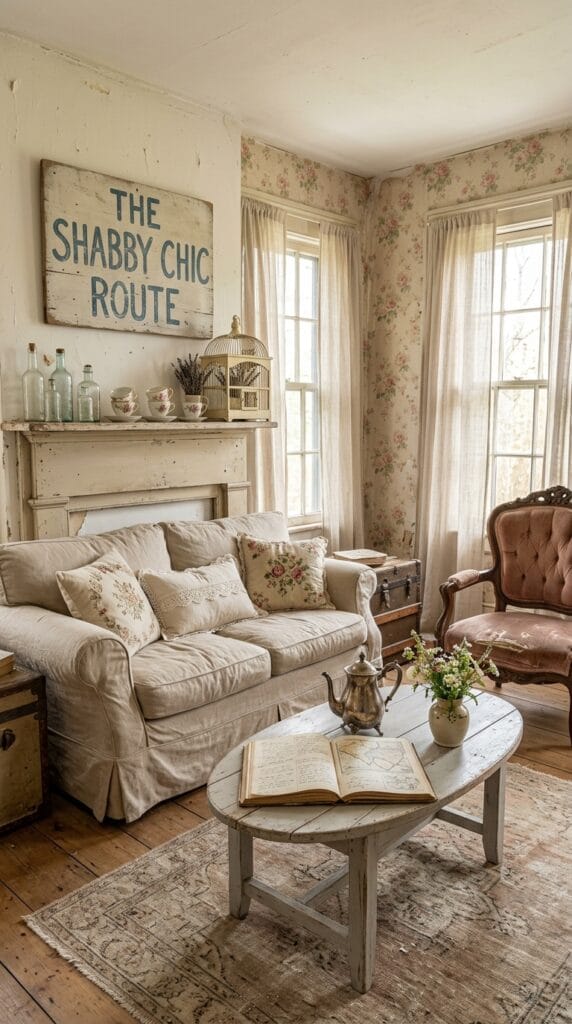
Shabby chic is romantic, slightly faded, and unapologetically feminine. It’s cottagecore without the farmhouse heaviness.
Your hero piece: Victorian Lilac, English Gardens, or any delicate, medium-scale floral on linen.
What to pair it with: Ruffled edges, tiny florals, lace-trimmed pillowcases, or soft stripes. Think Vermont Country Store meets Anthropologie.
Color story: Soft lilacs, creams, pale pinks, and whites. Maybe one accent color like sage green or dusty blue.
Texture matters here: Linen, cotton, and ruffled details create that slightly worn-in aesthetic that makes shabby chic feel authentic.
The Botanical/Calming Vibe
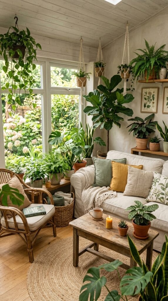
This is for people who want floral bedding that actually helps them relax. Think moonlit gardens and peaceful jungle vibes.
Your hero piece: Moonlit Taj (blue-green vines), tropical garden prints, or botanical illustrations on calm backgrounds.
What to pair it with: Subtle solid colors (like microfiber in matching greens or blues), delicate vine patterns, or simple geometric accents.
Color story: Cooling blues, forest greens, soft grays. These colors literally trigger relaxation in your brain, so lean into that.
The Art Deco/Moroccan Drama

Want something statement-making? Art Deco and Moroccan florals demand attention and pair beautifully with jewel tones.
Your hero piece: 1920s-inspired geometric florals, Mosaique Bleue (intricate blue patterns), or any bold print with architectural energy.
What to pair it with: Rich solid colors (think amethyst, sapphire, or emerald sheets), simple geometric patterns, or metallic accents.
Color story: Deep jewel tones, metallic golds or silvers, and contrasting creams. This isn’t subtle—and that’s the whole point.
How to Actually Layer Your Bed Without Causing a Design Disaster
Alright, so you’ve picked your hero floral and your complementary patterns. Now comes the fun part—actually arranging everything so it looks cohesive instead of random.
Start Simple, Add Layers Gradually
Step 1: Start with your duvet or quilt (your hero piece) + neutral sheets underneath. I usually go with cream, white, or soft gray sheets because they don’t compete with your main pattern.
Step 2: Add one or two coordinating pillows at the head. Maybe one matches your duvet exactly, and one features your complementary pattern (the stripes, the small florals, the polka dots).
Step 3: Layer in accent pillows with different shapes and sizes. A square pillow in your matching color, a lumbar pillow in your complementary pattern, maybe a round accent pillow in a solid jewel tone if you’re feeling spicy.
Step 4: Throw on a textured throw blanket or bedspread in a complementary color or pattern. This adds dimension without overwhelming the space.
The goal? Your eye should move naturally from piece to piece, with no single element screaming for all the attention.
Pro Layering Tips
- Odd numbers work better. Three or five pillows looks intentional; four or six looks accidental. I don’t make the rules; design just works that way.
- Vary your pillow sizes. Mix standard pillows, king-size pillows, and lumbar pillows so nothing looks too uniform.
- Let one pattern dominate. Your hero floral should cover about 50% of the visible bed. Everything else fills in around it.
- Test before you commit. Take a photo and look at it for a few days. Your brain needs time to adjust, and what feels chaotic on Day 1 might feel balanced by Day 3.
Common Mixing Mistakes (And How to Fix Them Fast)
Even with the best intentions, it’s easy to go wrong. Let me walk you through the most common oopsies—and how to save your bedroom from looking like a fabric explosion.
Mistake #1: Too Many Colors Competing for Attention
What it looks like: You pair that ruby poppy duvet with navy stripes and green pillows and mustard accent pillows. Suddenly your bedroom feels like a paint swatch card.
The fix: Stick to your 3-color maximum (plus neutrals). If you’ve already bought conflicting pieces, swap out one accent pillow or throw. Simplicity wins every time.
Mistake #2: Clashing Color Temperatures
What it looks like: A warm-toned orange blossom duvet with cool-toned gray-blue stripes. Nothing’s technically wrong, but something feels off.
The fix: Before buying, hold your hero floral next to potential matches in natural light. Do the colors feel like they belong in the same room? If you’re squinting and second-guessing, they probably don’t.
Mistake #3: Two Large-Scale Patterns Fighting for Dominance
What it looks like: Large poppies on your duvet + large paisley on your sheets. Your bed becomes a visual battle zone.
The fix: If you’ve already committed, swap one of the pieces for a small-scale version of a complementary pattern. Or use one as your duvet and relegate the other to a throw blanket.
Mistake #4: Forgetting About Proportion
What it looks like: A queen-size duvet takes up 70% of your bed. Pile too many large accent pillows on top, and suddenly your bed looks crowded.
The fix: Remember that your duvet is the star. Accent pillows are supporting players. Give them room to shine without overwhelming the composition.
Shopping Smart: Where to Find Mix-and-Match Floral Bedding Sets
Okay, real talk—not all floral bedding is created equal. Some brands get the whole mix-and-match aesthetic, and others sell sets that demand you use exactly what’s in the box.
Brands That Nail This
Anthropologie: Literally designed for mixing. Their florals pair beautifully with their solids and geometric patterns. Fair warning: you’ll pay for it, but the quality justifies the price.
Saffron Marigold: If you’re into block-printed, artisanal vibes, this is your brand. Their prints are designed to layer with each other, and their color palettes are chef’s kiss.
Vermont Country Store: Shabby chic heaven. They specialize in coordinating florals that feel vintage without being dated.
Roomtery: Offers affordable options in botanical and floral styles with multiple coordinating pieces. Great for people who want the aesthetic without breaking the bank.
West Elm: Modern florals that pair well with their minimalist solids and geometric patterns.
Lands’ End: Surprisingly good for coordinated floral sets, especially if you’re into classic, preppy aesthetics.
Budget-Friendly Approach
Don’t have tons of money? Start with one solid-color duvet in a neutral (white, cream, or soft gray), then layer florals through sheets, pillowcases, and throws. You can swap seasonal prints without replacing your entire bedding. IMO, this is actually the smartest approach because it gives you flexibility.
Real Examples: Bedding Combinations That Actually Exist
Let me give you specific combos that real people have created (based on verified design tips and customer inspirations):
Boho Orange Dreams
Hero piece: Orange Blossom duvet (warm vintage florals with apricot and sage tones)
Complementary layers:
- Cream pinstriped sheets
- Small sage-green floral pillowcase
- Burnt orange throw blanket
Why it works: The shared orange and cream tie everything together. The stripe sheets provide visual breathing room. The small floral adds another layer of botanical interest without competing at the same scale.
Vibe: Cozy, collected, effortlessly bohemian.
Bold Kilim Statement
Hero piece: Ruby Kilim duvet (intricate crimson and black geometric-floral pattern)
Complementary layers:
- Cream-and-red striped sheets (thin stripes)
- Solid black accent pillow
- White ruffled pillowcase
Why it works: The stripes echo the kilim’s colors without competing. The solid black pillow grounds the boldness. The ruffles add romantic texture without clashing.
Vibe: Sophisticated, intentional, slightly dramatic.
Spring Coquette Refresh
Hero piece: Spring floral duvet (soft pink, pale blue, and white pastels)
Complementary layers:
- Pale blue striped sheets
- White gingham pillowcase
- Soft pink linen throw pillow
- Silk accent pillows in coordinating pastels
Why it works: The stripes and gingham echo the color palette at smaller scales. The silk throws add unexpected texture. Everything feels coordinated without being matchy-matchy.
Vibe: Airy, romantic, effortlessly spring-ready.
The Seasonal Refresh: How to Keep Your Bed Fresh Year-Round
Here’s something I genuinely love about mastering floral mixing—you can refresh your entire bedroom aesthetic without spending a fortune.
In spring, lean into pastels and delicate florals. Summer? Go tropical with hibiscus and monstera prints. Fall calls for deeper florals in burnt orange, burgundy, and forest green. Winter works with jewel-tone botanicals and cozy textures.
The hack: Keep your neutral base sheets year-round (cream or white works with everything), then swap your duvet, throw pillows, and throws seasonally. This way, you’re only buying a few pieces each season, but your room feels completely refreshed.
It’s honestly the most cost-effective way to keep your bedding from feeling stale.
Final Thoughts: Your Floral Bedding Masterpiece Awaits
Mixing floral prints isn’t rocket science, but it does require intention. Stick to your three core rules—anchor with shared colors, vary your scales, and balance boldness with neutrals—and you literally can’t go wrong.
The beautiful part? Once you nail these principles, you can apply them to literally any floral print you fall in love with. That random botanical print you spotted? The vintage roses that made you swoon? You now have the framework to make them work together.
So go ahead—start with your hero floral, pick your coordinating patterns, and create a bed that actually makes you want to stay there. Your bedroom is about to get a serious upgrade. 🙂