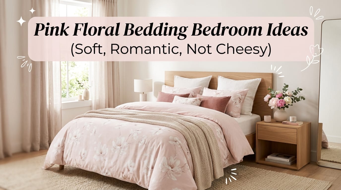
Look, I get it. The phrase “pink floral bedding” probably conjures up images of something your great-aunt would love—you know, the kind of bedroom that screams “frilly and over-the-top.” But here’s the thing: pink floral bedding done right is actually stunning, sophisticated, and genuinely romantic without veering into saccharine territory. The secret? It’s all about restraint, intentional color choices, and knowing which design principles actually work. Let me walk you through how to nail this aesthetic so your bedroom becomes the dreamy sanctuary you actually want to spend time in.
The Psychology Behind Soft Pink Florals (And Why It Actually Works)
Ever wondered why soft pink feels so calming? There’s real science here. Blush and dusty rose tones activate the parasympathetic nervous system, which means your body literally relaxes when you’re surrounded by these hues. Throw in delicate floral patterns, and you’ve created a visual representation of peace itself.
The trick is avoiding that “little girl’s room” vibe. You achieve this by going for muted, sophisticated pinks—think dusty rose or blush rather than hot pink or Barbie bright. Pair these with crisp neutrals like white, cream, or soft gray, and suddenly you’ve got something that feels grown-up and intentional rather than saccharine and overdone.
I’m genuinely convinced that the main reason people shy away from pink bedding is because they’ve only ever seen the wrong version. When you nail the color palette, everyone immediately gets why you chose it. 🙂
Choosing Your Color Palette: The Foundation of Everything
The Blush Pink Sweet Spot
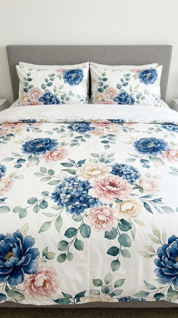
Blush pink sits right in that Goldilocks zone—it’s pink enough to feel romantic, but neutral enough to work with almost any décor style. Brands like Saffron Marigold have absolutely nailed this with their Dahlia Daydreams duvet, which features raspberry florals on a soft, almost ivory-white ground. This reversibility means you get a neutral side too, which is genuinely brilliant for versatility.
The beauty here is that blush works because it doesn’t dominate your space. It whispers instead of screaming.
Pairing Pink With Neutrals
Here’s where most people get it right or catastrophically wrong. You need a strong neutral backbone:
- White or cream: Creates airiness and freshness; makes the space feel larger and more luxurious
- Soft gray: Adds sophistication without coldness; absolutely kills it with dusty rose
- Pale beige or taupe: Brings warmth while maintaining elegance; less stark than pure white
The 60/30/10 rule applies here—60% should be your neutral base, 30% your pink tones, and 10% accent colors. This prevents your bedroom from becoming a pink explosion, which is definitely the enemy of looking grown-up.
Accent Colors That Elevate (Not Complicate)
| Accent Color | Effect | Best For |
|---|---|---|
| Rose gold or pale brass | Adds glamorous warmth without being cheesy | Metallic accents on mirrors, lamps, frames |
| Pale oak or natural wood | Brings organic texture and grounding energy | Bedframes, nightstands, floating shelves |
| Soft sage or muted blue | Creates subtle contrast that prevents monotony | Throw pillows, area rugs, artwork |
| Charcoal or deep gray | Adds drama and maturity | Picture frames, accent walls, throw blankets |
Building Layers: Textures That Transform Everything
Okay, real talk: bedding is basically an outfit for your bed, and just like with clothes, texture is where the magic happens. You wouldn’t wear all cotton on a date, right? Same principle applies here.
The Bedding Foundation
Start with high-quality base layers. I’m talking organic cotton percale or linen—not because they’re trendy, but because they actually feel amazing and last forever. A reversible floral duvet is genuinely one of the smartest investments you can make because you literally get two color schemes in one piece.
Your foundation should include:
- A quality duvet in blush or dusty rose florals (reversible bonus points)
- Crisp white or cream sheet set (preferably percale for that luxury feel)
- A quilted throw or blanket in a coordinating neutral
The Pillow Strategy
This is where people either nail it or completely overwhelm their bed. You don’t need seventeen pillows to look styled—you need maybe three or four really good ones.
Layer them like this from back to front:
- Two larger pillows in white or cream (the actual sleeping pillows)
- One standard pillow in your floral duvet pattern
- One or two accent pillows in solid pink or complementary textures
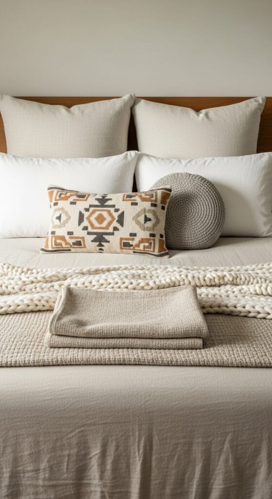
Mix textures here—combine a velvet pillow with a linen one, or throw in a macramé or knitted textured pillow for dimension. This creates visual interest without looking chaotic, and honestly, it’s the difference between “bedroom” and “sanctuary.”
Textural Elements That Matter
- Velvet throws: Luxurious and romantic; drape across the foot of the bed
- Knitted blankets or cable-knit throws: Add coziness and visual texture
- Linen bedding: The gold standard for elegant simplicity
- Rattan or woven accents: Bring boho-casual warmth without clashing with florals
Avoiding the Cheesiness Trap: What NOT to Do
Listen, I’ve scrolled through enough Pinterest boards to know exactly what makes a pink floral bedroom cringe-worthy. Here’s what you actively want to avoid:
The Pattern Overload Mistake
Mixing multiple floral prints sounds fun in theory. In practice, it looks like you raided a cottage-core gift shop and decorated with everything. Stick to one strong floral print as your focal point, then keep everything else solid or subtly textured.
The Too-Bright Pink Problem
Hot pink, shocking pink, Barbie pink—these don’t whisper, they scream. They also date faster than TikTok trends. Go for muted, sophisticated tones instead, and your bedroom won’t look dated in two years.
The Accessory Explosion
Fairy lights are adorable. Ceramic bunnies are cute. A thousand little knickknacks? That’s a recipe for visual chaos. Keep accessories minimal and intentional—think fresh roses in one perfect vase, a single string of warm-white fairy lights, maybe a piece of art that ties everything together.
The Furniture Mismatch
Pairing delicate floral bedding with heavy, dark furniture creates visual discord. Stick with either soft, curved upholstered pieces or light natural wood frames. The vibe should feel cohesive, not like you grabbed furniture from three different eras.
Real Design Ideas That Actually Work
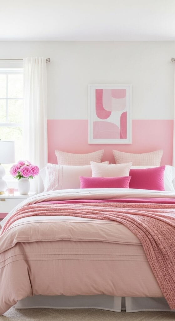
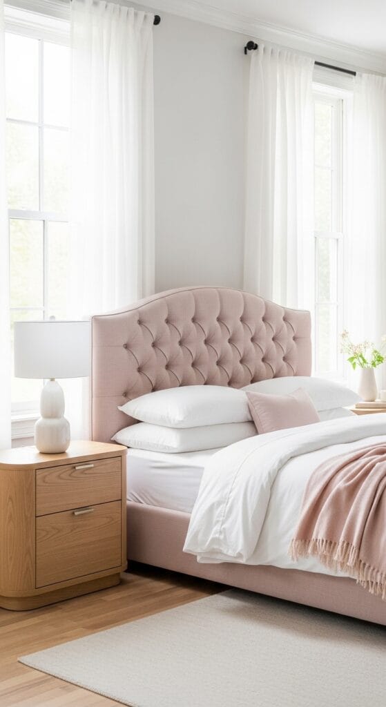
The Minimalist Romantic (aka My Personal Favorite)
This approach keeps things super clean and intentional. You’re working with blush pink florals on a white ground, white crisp sheets, and maybe one textured throw in cream or pale gray. Add rose gold or brass accents through your nightstand lamps and mirror frames, and you’ve got understated elegance that feels mature and put-together.
The genius here? Everything feels intentional because it is intentional. Nothing feels accidental or overdone.
The Boho-Romantic Blend
This one layers dusty rose florals with natural textures like macramé wall hangings, woven throws, and rattan accents. You’re creating that “I picked wildflowers and decorated my bedroom” vibe, but in a refined way. Pair floral bedding with a sisal rug underneath, add some potted greenery, and suddenly your room feels like a peaceful retreat.
The Glam Approach
Here’s where you lean into the romance with velvet elements, subtle metallic accents, and maybe even a tufted headboard in blush. This version works beautifully in a bedroom with high ceilings, plenty of natural light, and thoughtful artwork. You’re not overdoing it, but you’re definitely making a statement about prioritizing comfort and beauty.
The Eclectic Personal Space
This is the “I’m unapologetically myself” approach where you mix your pink floral bedding with pieces that genuinely make you happy—maybe a vintage mirror, blue-toned artwork, or eclectic throw pillows. The key is that everything still works within your neutral-pink-accent color story, so even though it’s eclectic, it feels cohesive.
Product Recommendations Worth Your Money
I hate generic product lists, so I’m only including stuff that actually delivers:
Budget-Friendly Winners
- Room Essentials Microfiber Set ($68): Not fancy, but surprisingly good quality for the price. The pink florals are subtle enough that you won’t outgrow them in six months.
- Threshold Floral Print Duvet Set ($50-$80): Target knows what they’re doing. This set hits the sweet spot between affordability and aesthetics.
Mid-Range Splurges (Where Quality Actually Matters)
- Intelligent Design Colette Floral Paisley Collection ($100-$150): IMO, this is where you get genuine quality without breaking the bank. The fabrication is noticeably better, and the pattern is sophisticated without trying too hard.
- Lush Décor Belle Quilt ($120-$180): If you want that heirloom quality, this delivers. The florals are watercolor-style, which reads as expensive even though it’s reasonably priced.
Premium Options (If You’re Feeling Fancy)
- Saffron Marigold Dahlia Daydreams Duvet ($200+): Okay, yes, it’s pricier, but the reversibility means you’re essentially getting two premium sets. The quality is genuinely noticeable, and it’ll last for years.
- Feather & Black Collections: These pieces are investment-level, but they deliver serious luxury and customization options.
The Room Setup Checklist: Putting It All Together
Ready to actually create this? Here’s how to do it systematically without making your bedroom look like a decorating explosion:
Step 1: Start With Your Base
Pick your floral duvet and reversible option. This is your anchor. Everything else builds from here.
Step 2: Layer Your Bedding
Add your neutral sheet set, then your throws and pillows. Step back and look at it. Does it feel balanced, or does one element feel too dominant?
Step 3: Address Your Wall Color
You don’t need to paint everything pink. Consider a accent wall in soft pink, or keep walls white and let your bedding do the talking. Honestly, white walls with pink bedding look more sophisticated than full pink rooms.
Step 4: Add Furniture Thoughtfully
If you’re replacing pieces, go for soft curves or light wood. A tufted headboard in blush linen? Absolutely brilliant. Heavy dark wood? Probably fighting against your aesthetic.
Step 5: Lighting Makes All the Difference
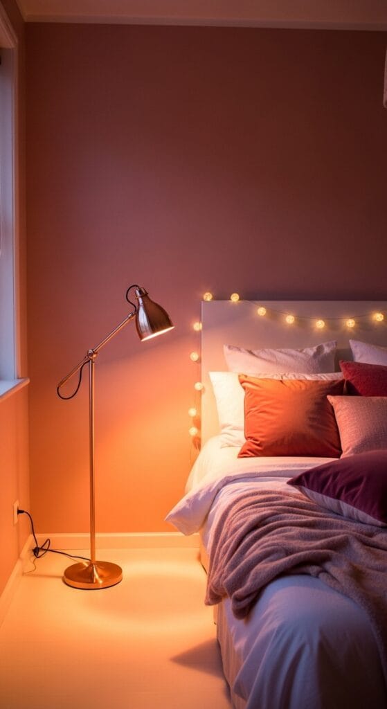
Warm-white bulbs (not cool LED) make pink look romantic instead of washed out. Add a brass or rose gold lamp for that extra touch of intentionality.
Step 6: Final Touches
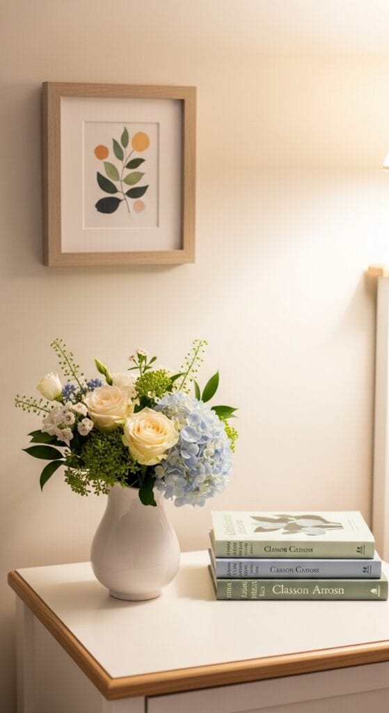
One perfect vase with fresh flowers, a few books on your nightstand, maybe some artwork that ties colors together. Restraint is your best friend here.
Common Mistakes People Make (And How to Avoid Them)
Mistake #1: Going All-In on Pink
You know what makes a room feel overwhelming? When everything is the same color family. You need white or neutral space to let your eyes rest. That’s not compromise—that’s design intelligence.
Mistake #2: Choosing the Wrong Pink Undertone
Some pinks lean peachy, some lean blue, some are just aggressively bright. Before you commit, get a fabric sample and look at it in your bedroom’s actual lighting. What looks romantic in a store might look completely different in your space.
Mistake #3: Ignoring Fabric Quality
Cheap polyester might look cute at first, but it pills, fades, and loses its softness after three washes. Invest in organic cotton, linen, or cotton blends that actually survive repeated washing. Your future self will thank you.
Mistake #4: Forgetting About Maintenance
Floral patterns show dirt more than solid colors. Stock up on some good fabric cleaner and a gentle touch when washing. Treat your pretty bedding like the investment it is.
Styling Your Bedroom Around Your Pink Floral Bedding
Okay, so your bedding is dialed in. Now what? The rest of your bedroom needs to work with it, not against it.
Wall Art and Décor
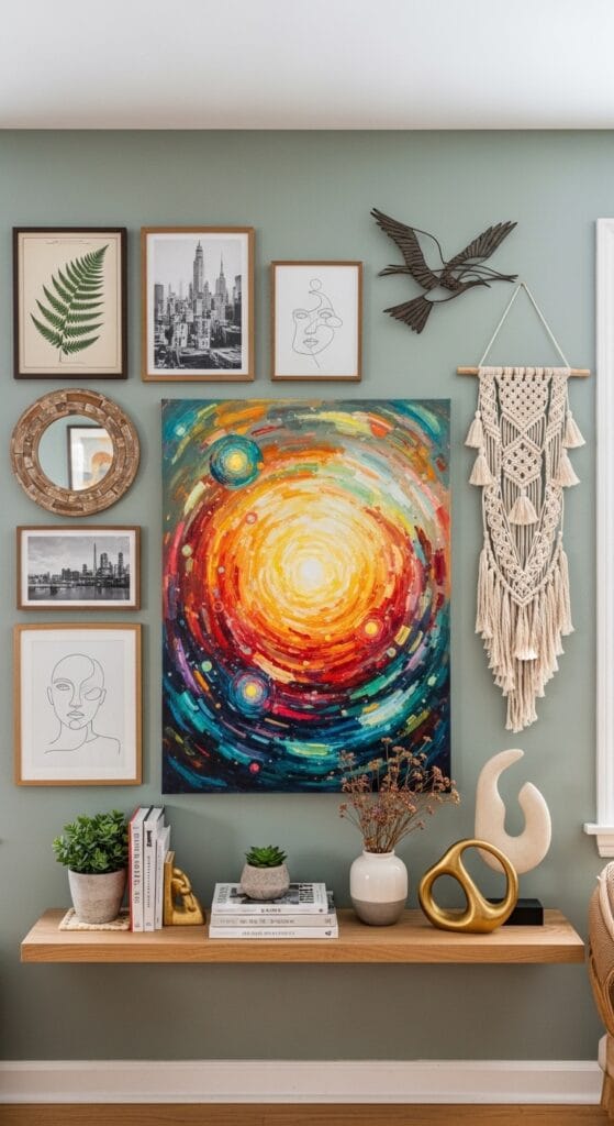
Keep artwork simple and intentional. One larger piece works better than a gallery wall when you’re already working with pattern on your bed. Consider botanical prints, abstract art in complementary colors, or even a simple landscape. You’re creating a cohesive story, not a visual competition.
Nightstands and Surfaces
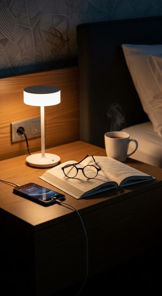
Style your nightstands with a good lamp, maybe a small vase with fresh flowers, and a stack of pretty books. That’s it. You don’t need a ton of stuff—you need intentional stuff.
Window Treatments
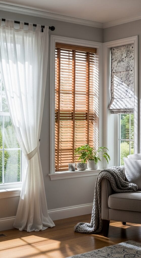
Soft, flowing curtains in white, cream, or pale gray complement pink floral bedding beautifully. They catch light, create softness, and feel romantic without being cheesy. If you go sheer, you get that dreamy quality. If you need blackout capability, go for solid neutrals that coordinate.
Rugs and Flooring
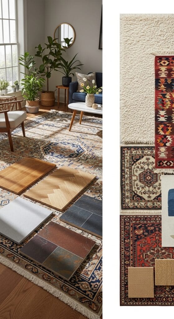
A soft rug under your bed grounds the space and adds texture. Neutral colors work best here—cream, soft gray, or even pale blue if you want subtle contrast. The rug shouldn’t compete with your bedding; it should support it.
Final Thoughts: Creating Your Romantic Retreat
Here’s the honest truth: pink floral bedding creates romance because it signals to your brain that you’ve prioritized beauty and comfort. That’s not cheesy—that’s self-care in design form.
The key to avoiding that overdone, clichéd look is simple: choose sophisticated tones, layer textures intentionally, and remember that white space and neutrals are your friends. You’re not trying to create a fantasy fairytale—you’re creating a real bedroom where you actually want to sleep, rest, and unwind.
Did you go too bright, too pattern-heavy, or too frilly? Learn from it and adjust. That’s the beauty of bedding—it’s not a permanent commitment. You can switch it up whenever you feel like something different.
So go ahead and embrace the pink. Do it with intention, quality, and a healthy respect for the power of neutrals. Your bedroom will thank you, and trust me, you’ll actually enjoy spending time in there instead of just using it to sleep. 🙂