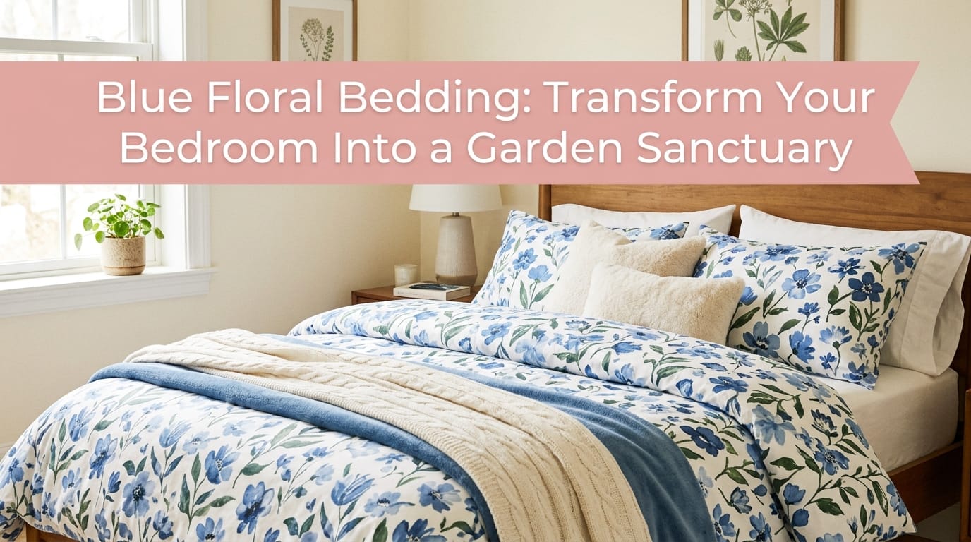
Ever scrolled through Pinterest at 2 AM, completely mesmerized by those dreamy blue floral bedding setups, only to wonder if you could actually pull off that look in your own bedroom? 🙂 Yeah, I’ve been there too. The good news? Creating a stunning bedroom with blue floral bedding isn’t some exclusive interior design secret—it’s totally doable, and I’m here to walk you through it like we’re just chatting over coffee.
Blue floral patterns hit different. They bring together the calming vibes of cool tones with the natural beauty of botanical prints, creating this sweet spot where sophistication meets comfort. Whether you’re going for a romantic cottage aesthetic, a modern boho vibe, or classic elegance, blue florals adapt to practically any style you throw at them. Let me break down exactly how to make this work in your space.
The Magic of Blue Floral Palettes: Where Everything Clicks
Classic Blue & White—The Timeless Combo That Never Quits
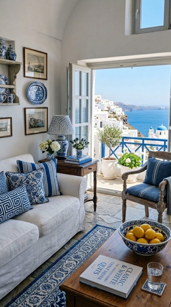
Here’s the thing about blue and white: it works. Like, it always works. I’m talking museum-level consistency here.
This pairing creates an instantly fresh, airy feeling that makes your bedroom feel like a designer showroom. You combine your blue floral duvet with crisp white sheets, add some white throw pillows, and boom—you’ve got a space that feels both elegant and effortlessly put-together. The white acts as a visual reset button, letting your floral pattern shine without overwhelming the space.
What I love most? This combo works whether you’re into delicate patterns like English Gardens or bolder designs with deeper navy blooms. The white just amplifies whatever vibe you’re going for.
Blue & Green—The Nature-Inspired Palette That Feels Like Home
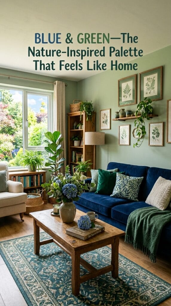
If blue and white feels a bit too sterile for your taste, let me introduce you to blue paired with green. This combination triggers something primal in our brains—it literally feels like nature.
Think sage green, pistachio, or soft ivy tones mixed with your blue floral bedding. These colors complement each other naturally because they hang out together in actual gardens and forests. You’re essentially recreating that peaceful, restorative feeling of being surrounded by plants, but you’re doing it from your bed. FYI, this palette also works brilliantly if you’re already into houseplants, which honestly makes your whole bedroom feel more cohesive.
Blue with Warm Pops—The Energizer for Your Sleep Space
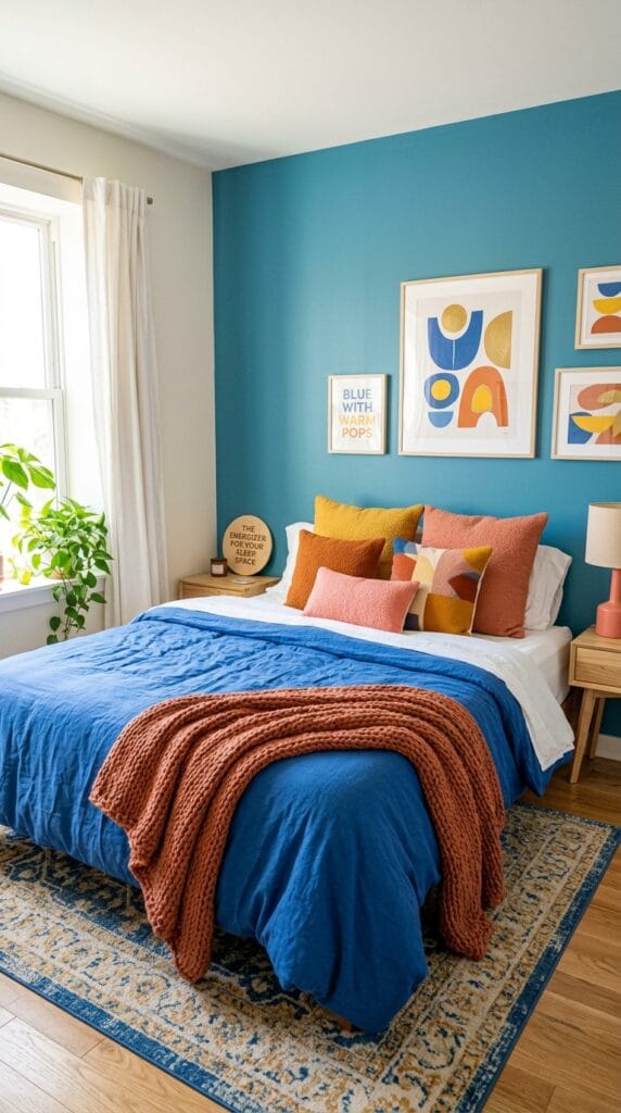
Want to add some personality without going full maximalist? Introduce warm accent colors like soft yellow, blush pink, or even dusty violet to your blue floral scheme.
This approach keeps the calming blue base while injecting joy and warmth. Yellow adds sunny optimism. Soft pink brings romantic charm. You’re balancing cool and warm tones, which creates visual interest without feeling chaotic. I’d use these warm colors through accent pillows, throws, or small decor pieces rather than large furniture items.
Navy, Indigo & Teal—The Bold, Moody Approach
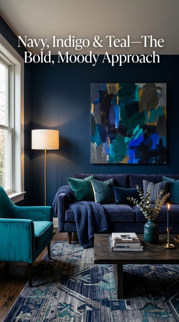
For those of us who like our bedrooms to have some attitude, pairing deep navy or indigo florals with teal and metallic accents creates this luxe, boho-dramatic vibe that’s honestly unmatched.
You’re working with rich, saturated colors here. Add a teal rug or some brass candlesticks, and suddenly your bedroom feels like a Moroccan-inspired retreat. This palette demands confidence, but if you’re willing to go bold, the payoff is stunning.
The Art of Layering: Building Your Blue Floral Dream Bed
Start Big, Work Small—The Reverse Pyramid Method
Think of building your bed like creating visual balance. Your largest piece—usually your duvet or bedspread with the bold blue floral print—anchors everything else. From there, you add medium-sized elements, then finish with small details.
Here’s the breakdown:
- Your blue floral duvet or bedspread is your statement piece
- Layer in coordinating sheets in a solid or subtle pattern
- Add 2-3 pillows mixing your palette
- Finish with a throw blanket and decorative pillows
The golden rule? Stick to shared hues while varying scale and pattern. You want everything to feel connected without looking like a matching furniture set from the 1990s.
Sheet Selection—The Foundation You Sleep On
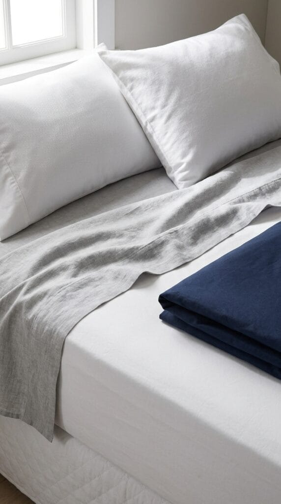
Your sheets deserve serious thought because, well, you literally spend 8 hours a night with them. I’m personally obsessed with organic cotton percale sheets in colors that pull directly from my floral pattern.
If your bedding features dusty blue florals, go with a corresponding dusty blue or ivory sheet. You could also go lighter or deeper for subtle depth—like pairing a mid-tone blue print with white sheets. The contrast keeps things from looking flat and boring. Pro tip: I always match my sheet color to one of the secondary colors in my floral print rather than trying to match the exact shade of every flower. That’s impossible anyway, and you’ll drive yourself nuts trying.
The Pillow Game—Where Personality Shines
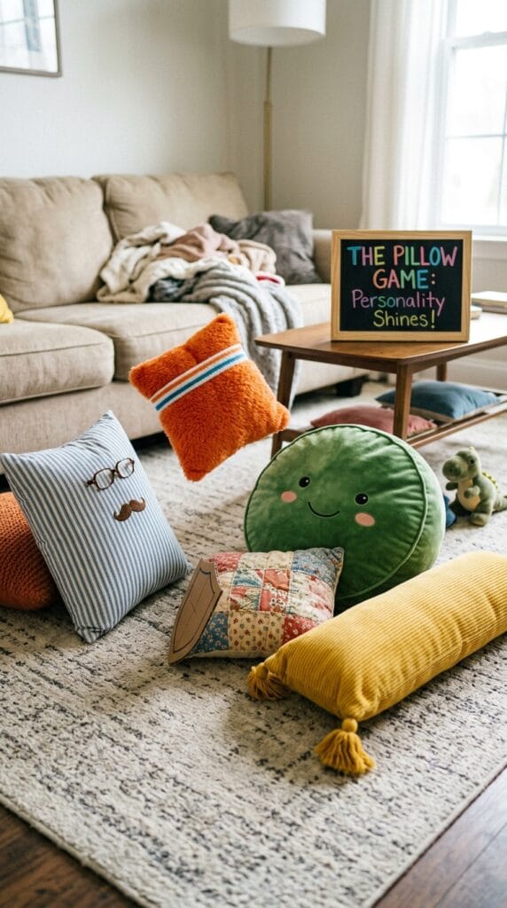
This is where you flex. Your pillows should reflect your overall bedroom aesthetic while coordinating with your blue floral duvet.
I recommend this formula:
- 1-2 pillows in a complementary color from your palette
- 1 pillow in a subtle pattern (stripes, polka dots, or mini florals)
- 1 decorative pillow in your blue floral pattern to echo your duvet
Mix textures too—add some with ruffles, lace trim, or beading. This prevents your bed from looking like it came straight from a furniture catalog.
Room-Wide Coordination: Making It All Tie Together
Your Walls & Furniture—The Silent Supporting Cast
Here’s what most people get wrong: they think they need to paint their walls blue to match their bedding. You absolutely don’t.
White or pale blue walls actually amplify your floral pattern by creating a clean backdrop. Your blue flowers pop more when surrounded by neutral tones. Pair this with creamy wood furniture or natural rattan pieces for balance. You’re creating contrast and visual breathing room, which makes your whole space feel more sophisticated.
Dark walls can work too if you’re going for moody drama, but you need to be intentional about it. Dark walls pull focus inward, so make sure your bedding is truly stunning enough to carry that weight.
Windows & Curtains—The Framing You Might Overlook
Your window treatments matter more than you’d think. They’re literally framing your view and influencing how light enters your space.
You’ve got options here:
- Blue floral curtains that echo your bedding (doubles down on the pattern)
- White or cream sheers for a fresh, airy feel
- Inverse patterns like white curtains with subtle blue stripes to tease out bedding colors without repeating the exact print
I personally lean toward white sheers because they keep the room from feeling visually heavy, but honestly, if you love your blue floral print, lean into it completely. Sometimes the best design choice is just doing what makes you happy. 🙂
Rugs & Flooring—The Grounding Elements
Your rug acts like an anchor for the entire room’s color scheme. A cobalt or medium blue rug works beautifully under white or light wood furniture, especially if it has subtle patterning.
If you’re doing the blue and green palette, consider a sage or soft green rug to ground the botanical vibes. For that bold Moroccan-inspired look with deep indigo florals, a teal rug with geometric patterns brings the whole aesthetic together. Your rug should pull at least two colors from your bedding palette but doesn’t need to match exactly.
Room-Specific Applications: Beyond Just the Bedroom
Bedrooms—Your Primary Canvas
This is where you go all-in. Your bedroom is your personal sanctuary, so feel free to be as bold or soft as you want with blue floral bedding.
I’d suggest: blue duvet + complementary sheets + 3 coordinating pillows + a cashmere or linen throw at the foot of the bed. Add a rug, style your nightstands with matching lamps, and you’ve got a complete, magazine-worthy space.
Living Rooms & Guest Spaces—Dialing It Back Slightly
Using blue floral bedding as an accent piece in living rooms or guest spaces requires restraint. You don’t want your couch looking like a bed 🙂
Instead, use blue floral throw pillows on a neutral sofa or hang matching curtains alongside solid-colored furniture. This approach gives you the botanical beauty without overwhelming the space. You’re adding interest and warmth without disrupting the overall design flow.
The Seasonal Approach—Smart Swapping

Here’s something I wish I’d learned earlier: rotate your bedding seasonally. Lightweight blue florals work great in spring and summer. Switch to heavier bedspreads or quilts with blue florals in fall and winter.
This keeps your space fresh year-round and means you’re not buying multiple full bedroom sets simultaneously, which is a serious wallet-saver.
| Palette Type | Best For | Why Choose It |
|---|---|---|
| Blue & White | Classic, fresh bedrooms; cottage style | Timeless, versatile, makes spaces feel bigger |
| Blue & Green | Nature lovers; boho aesthetic | Calming, naturally cohesive, botanical vibes |
| Blue + Warm Accents | Personality-driven spaces; modern bedrooms | Balances cool tones; adds joy and depth |
| Navy/Indigo + Teal | Dramatic, moody spaces; luxury aesthetic | Bold, sophisticated, high-impact |
Common Mistakes That’ll Sabotage Your Vision (And How to Fix Them)
Too Many Competing Florals—Pattern Overload Alert
I’ve seen bedrooms where someone mixed three different floral patterns thinking it would look eclectic and interesting. It didn’t. It looked chaotic.
The fix? Stick to a maximum of three patterns across your entire bed setup. Your main floral duvet counts as pattern #1. One striped or subtle-patterned pillow is pattern #2. Maybe a small floral accent pillow is pattern #3. Everything else should be solid colors. This creates visual harmony instead of visual confusion.
Ignoring Lighting—The Invisible Game Changer
Here’s something nobody talks about enough: natural light absolutely changes how colors appear in your space.
A dusty blue looks completely different in bright afternoon sun versus soft morning light versus evening lamplight. Before you commit to a full bedroom redesign, spend a day in your space at different times. Bring home fabric swatches if possible. What looks perfect at the store might look dingy or too bright in your actual bedroom. I learned this the hard way and ended up with a bedding set that looked grayer than I wanted in morning light.
Neglecting Balance—Making Everything Too Matchy-Matchy
Sometimes our instinct is to make everything coordinate perfectly. Floral duvet? Matching floral curtains. Blue rug? Blue nightstands. This approach makes your space look like a showroom, not a home.
You need breathing room and contrast. Mix your florals with solids. Use white or cream to break up color saturation. Introduce textures and unexpected elements. The most beautiful bedrooms feel lived-in and thoughtfully designed, not like everything came from the same catalog.
Pro Tips That’ll Elevate Your Entire Game
Invest in Quality Basics
You spend roughly a third of your life in bed. Splurge on your sheets and pillows, not necessarily your decorative throw pillows.
Organic cotton percale or sateen sheets feel incredible and last forever. A supportive pillow that actually contours to your head beats a pretty pillow that gives you neck pain. Your guests might notice your Instagram-worthy decorative pillows, but you’ll notice quality sheets every single night.
Consider Reversible Duvets
Here’s a game-changer I stumbled upon: reversible duvet covers. One side has your gorgeous blue floral print, and the flip side is a solid color that coordinates with your palette.
This means you can literally flip your entire bedroom aesthetic without buying new bedding. Spring/summer side is floral. Fall/winter side is solid. You’re getting maximum value, and honestly, it’s such a practical solution I’m shocked it’s not more popular.
Accessorize Thoughtfully
Use decorative items like throw blankets, vases, and framed botanical prints to tie your color scheme throughout the room.
A cream throw at the foot of your bed echoes your walls. A sage green vase on your nightstand pulls from your green accents. A framed floral print above your bed reinforces your theme without looking forced. You’re building a cohesive narrative where everything feels intentional.
Layer Your Lighting
Ambient lighting, task lighting, and accent lighting completely transform how your blue floral bedding looks and feels.
A brass lamp on your nightstand warms up cool blue tones. Soft string lights or a dimmer switch add coziness. A decorative ceiling fixture finishes the look. You’re not just making the space brighter; you’re creating mood and depth.
Your Blue Floral Bedroom Awaits
Creating a stunning bedroom with blue floral bedding doesn’t require hiring an interior designer or spending your entire savings account. You need intention, a clear color palette, and the confidence to make choices that feel right for your space.
Start with whichever palette speaks to you most—classic blue and white if you want timeless elegance, blue and green if you’re drawn to natural calm, or bold navy and teal if you want dramatic sophistication. Then build outward methodically, avoiding pattern overload and respecting lighting in your space.
The most important thing? Choose bedding you genuinely love, not what you think you should like. You’re going to see this every single morning, so make it something that makes you smile. Your bedroom should feel like your personal retreat, not a Pinterest board come to life. Sweet dreams! 🙂
1 thought on “Blue Floral Bedding: Transform Your Bedroom Into a Garden Sanctuary”