Let’s be real—floral comforters are gorgeous. They add charm, personality, and that cozy cottage-core vibe we all secretly crave. But here’s the thing: one wrong move and your bedroom transforms into a botanical nightmare where every surface screams “LOOK AT MY FLOWERS!” 🙂
I’ve been there. I bought this stunning floral comforter with pale pink peonies and sage green leaves, thinking I’d finally achieved bedroom goals. Then I piled it onto my colorful sheets, added a patterned throw, hung busy curtains, and—yikes. My bedroom looked like it was competing in a pattern competition nobody asked for. After some trial and error (and honestly, a lot of Pinterest scrolling), I figured out the secret: balance is everything.
Here’s what I want to share with you: you can absolutely rock a floral comforter without turning your sleeping space into visual chaos. It just takes a few intentional moves. So let’s break this down together.
Start With a Calm Color Palette—This Is Your Foundation
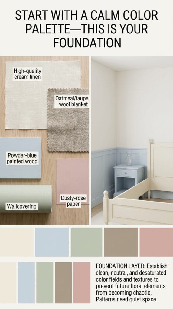
Think of your floral comforter as the main character of your bedroom story. Everything else should play a supporting role, not steal the spotlight.
The first thing you need to do is pull 1-2 dominant colors directly from your comforter. If your florals feature soft blush pink and dusty blue, use those colors as your guide. Don’t pick random colors that vaguely match—go for the exact shades hidden in the pattern.
Stick to Neutrals for Your Base Layers
Your sheets are the unsung heroes here. I recommend choosing from this palette:
- Crisp white for that clean, airy feel
- Soft linen (that natural flax color) for texture without pattern
- Pale blush or sage if you want a whisper of color
- Warm cream for a cozy vibe
FYI, this isn’t the time to get creative with your sheets. You’re literally creating a blank canvas for your comforter to shine. I learned this the hard way when I paired my peonies with navy blue sheets—it looked heavy and dated, not light and fresh.
Avoid These Color Traps
Here’s what not to do: don’t reach for vibrant, clashing colors just because they’re in your comforter’s pattern. If your floral has hints of coral, mustard, or deep purple, skip those on your sheets. Instead, bring in those accent colors through smaller pieces like throw pillows or a single decorative pillow.
Ever wondered why hotel bedrooms always feel so peaceful? They nail the neutral-base thing. Your bedroom should make you feel like you’re checking into a boutique inn, not like you’ve walked into a fabric store display.
Layer Smartly With Texture and Scale Contrast
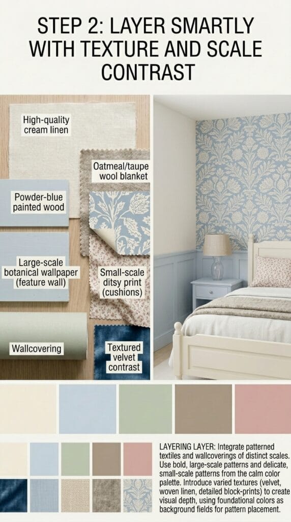
Okay, so you’ve got your neutral sheets sorted. Now we need to talk about the art of layering without overdoing it.
The Scale Game—It’s Real
Here’s a principle that changed my approach: mix different scales of pattern, or use solids strategically. If your comforter features large, bold blooms, your sheets should either be completely solid or have a tiny, barely-visible pattern.
Think about it this way—if you layer big florals on top of medium florals on top of small florals, your eye doesn’t know where to land. It’s exhausting. Instead, you want a visual rhythm. Something like this works beautifully:
- Solid sheet base (your neutral pick)
- Large floral comforter (the star)
- Solid or tiny-scale throw at the foot
This creates breathing room and lets your main comforter actually be the main event.
Don’t Overthink the Layers
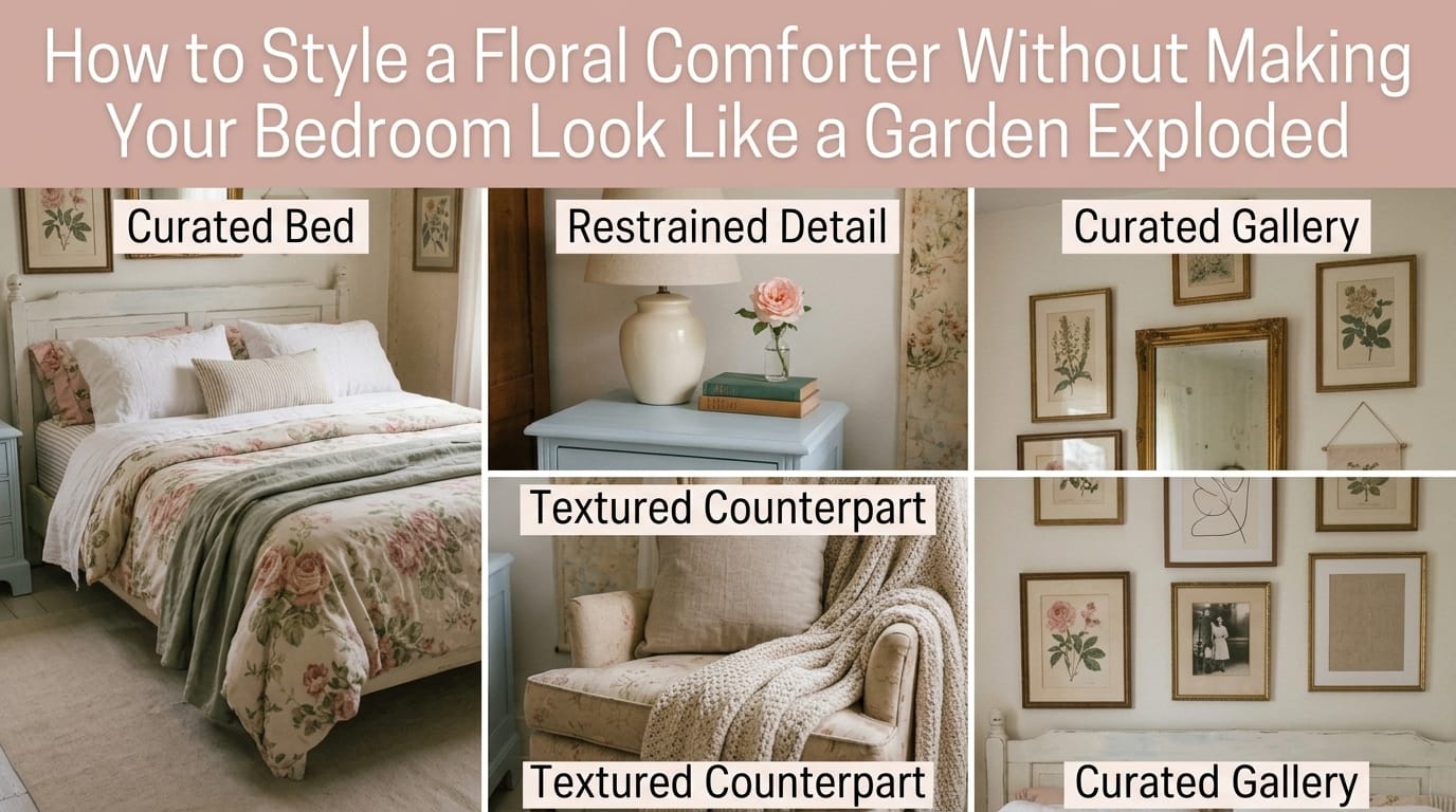
I see people making this mistake constantly: they pile on a duvet, then a quilt, then a bed cover, then THREE decorative throws, and suddenly you can barely see the actual comforter. Stop. Here’s what actually works:
- One primary layer (your floral comforter)
- One secondary layer (a throw blanket in a complementary solid)
- Pillows (2-4 max—seriously, limit yourself)
That’s it. You don’t need more. Your bed should look inviting, not like you’re preparing for hibernation.
Add Texture, Not Patterns
If you want to add visual interest beyond your floral comforter, lean into texture instead of patterns. A chunky knit throw, a sateen quilt, or linen with subtle embroidery gives your bed dimension without creating visual competition.
I have a hand-knitted throw at the foot of my bed that’s cream-colored, and it adds so much coziness without making my space feel busy. Texture is your secret weapon here.
Keep Your Furniture and Walls Simple—It’s Non-Negotiable

Your floral comforter is the statement piece. Everything else should whisper, not shout.
What Your Furniture Should Look Like
Pick furniture in natural wood, wicker, rattan, or creamy painted finishes. These materials feel organic and let your comforter be the focal point instead of competing for attention.
Dark, ornate furniture? Busy patterns on your dresser? Multiple colors clashing together? These things will make your bedroom feel cramped and chaotic. You want your eye to settle on the bed, appreciate the comforter, then move naturally to other elements.
I swapped my dark brown dresser for a light wood piece, and honestly, it made my entire room feel 10x more intentional. The floral comforter stands out without overwhelming the space.
Your Walls Need to Stay Neutral
This is where so many people mess up. They buy a gorgeous floral comforter, then slap floral wallpaper on the walls or paint them a bold accent color. Hard stop.
Keep your walls solid and soft. Think:
- Crisp white
- Warm cream
- Soft gray
- Pale sage (if your comforter has green)
- Barely-there blush
If you really want pattern on walls, consider subtle vertical stripes or a delicate inverse floral (something so faint it almost disappears). But honestly? Solid walls let your comforter be the design statement it deserves to be.
Window Treatments and Lighting Create the Atmosphere

Ever notice how light completely changes how busy something looks? The same floral comforter appears one way in bright daylight and totally different under warm lamp glow. Let’s maximize the positive effect.
Curtains Should Be Subtle
Your curtains are another opportunity to support, not compete. Here’s what I recommend:
- White or cream sheers for an airy, romantic feel
- Solid curtains in one of your comforter’s accent colors (but in a muted tone)
- Linen or cotton blend to keep things natural and light
Avoid heavy velvet, busy patterns, or dark colors that block light and make your space feel smaller. You want light to pour through and make your comforter’s colors pop.
Bring in Natural Elements
This is where plants come in, and IMO, they’re non-negotiable for balancing a floral comforter. Adding a potted plant (or three) on your nightstand or window sill creates a cohesive, curated feel. The green tones tie naturally to florals without adding pattern.
Soft, warm lighting also matters. A few strategically placed lamps (think warm white bulbs, not harsh bright ones) make your bedroom feel like a sanctuary, not an interrogation room.
Accessorize Minimally for Maximum Impact
This is where your personal style comes in, but here’s the key: less is always more when you’ve already got a statement comforter.
Pillows and Throws
Stick to 2-4 pillows total. Sounds limiting, but it looks so much cleaner and more intentional. I go with:
- One solid lumbar pillow (usually in a neutral)
- One or two textured accent pillows (maybe linen, or a subtle weave)
- One decorative pillow in a soft neutral or subtle pattern (optional)
A single throw blanket at the foot of your bed completes the look without excess. Choose something in a complementary color or neutral that echoes the softer tones in your comforter.
Personal Touches (Keep Them Curated)
This is where you inject personality without chaos. A few framed photos, a candle, a small plant—these things make your bedroom yours. Just make sure they’re minimal, thoughtful, and don’t visually compete with your comforter.
Common Mistakes to Avoid
Let me save you some time and heartache by calling out the biggest mess-ups I see:
Mistake #1: Layering Multiple Large Florals
You know what doesn’t work? A large floral comforter + floral shams + floral throw pillows + floral curtains. Your eye doesn’t know where to focus, and everything blurs together into a chaotic bloom situation.
Mistake #2: Ignoring Your Room’s Scale
A tiny bedroom with a bold, large-scale floral comforter needs serious neutral backup. A spacious master bedroom can handle slightly more pattern and color because the visual weight distributes differently. Think about your space before choosing your comforter pattern.
Mistake #3: Using Too Many Colors
Cap yourself at 3-4 total colors in your bedroom. Seriously. Your floral comforter already contains multiple colors, so everything else should echo just one or two of those tones.
Mistake #4: Forgetting About Texture
Pattern isn’t the only way to add interest. Texture does the heavy lifting without creating busyness. Linen, cotton, knits, and woven materials give your bed dimension and feel luxe.
Style Inspiration: How to Adapt This to Your Vibe
The Romantic Cottage Aesthetic
Think: pale pink florals, white sheets, cream linen duvet, delicate lace trim, a chunky knit throw, and soft pink curtains. Add dried flowers in a small vase and minimal brass accents. This style whispers elegance.
The Modern Minimalist Approach
Imagine: muted sage green florals, crisp white sheets, a solid cream comforter layered underneath, a single neutral throw, and pale gray walls. Keep accessories to an absolute minimum. This style lets the comforter be the sole design statement.
The Cozy Modern Farmhouse
Picture: soft blue and white florals, flax linen sheets, a natural wood bed frame, wicker nightstands, and cream curtains with subtle texture. Add a hand-knitted throw and potted plants. This style feels lived-in but intentional.
The Spring-Into-Summer Vibe
Go with: pale pink peonies, white percale sheets, light filtering sheers, one cream throw, and minimalist nightstands. This setup feels fresh, airy, and perfectly suited for warm months.
Common Questions (Because You’re Probably Wondering)
Can I Layer Different Floral Patterns Together?
Yes, but—and this is a big but—they need to be wildly different scales or color palettes. A large peony comforter + tiny ditsy floral sheets can work if they share a color story. But large peonies + large roses? That’s a hard no from me.
What If My Floral Comforter Has Multiple Bold Colors?
Pull just one or two from the pattern and use those sparingly. If your comforter has coral, mustard, pink, and green, pick the pink and green for your supporting pieces, and keep everything else neutral. This grounds the look and prevents visual overload.
Should I Get a Floral Duvet Cover Instead of Using the Comforter As-Is?
Honestly, it depends. A duvet cover gives you flexibility to change your look, but if you love your comforter’s design, use it. Just be extra intentional about everything layered on top.
Final Thoughts: Your Bedroom Should Feel Like a Retreat
Here’s what I want you to take away from all this: a floral comforter is a tool for creating a beautiful bedroom, not a liability. The key is understanding that one statement piece needs supporting players who know how to stay in the background.
Your bedroom is where you wake up, where you unwind, where you spend a third of your life. It deserves to feel intentional, peaceful, and uniquely you—not like you’ve accidentally recreated a botanical garden in your sleeping space.
Start with neutrals, add texture thoughtfully, keep your furniture simple, and resist the urge to pattern everything. Your floral comforter will shine, your space will feel sophisticated, and you’ll actually enjoy being in your bedroom. That’s the whole point, right? 🙂
Now go forth and create the balanced, beautiful bedroom you deserve!