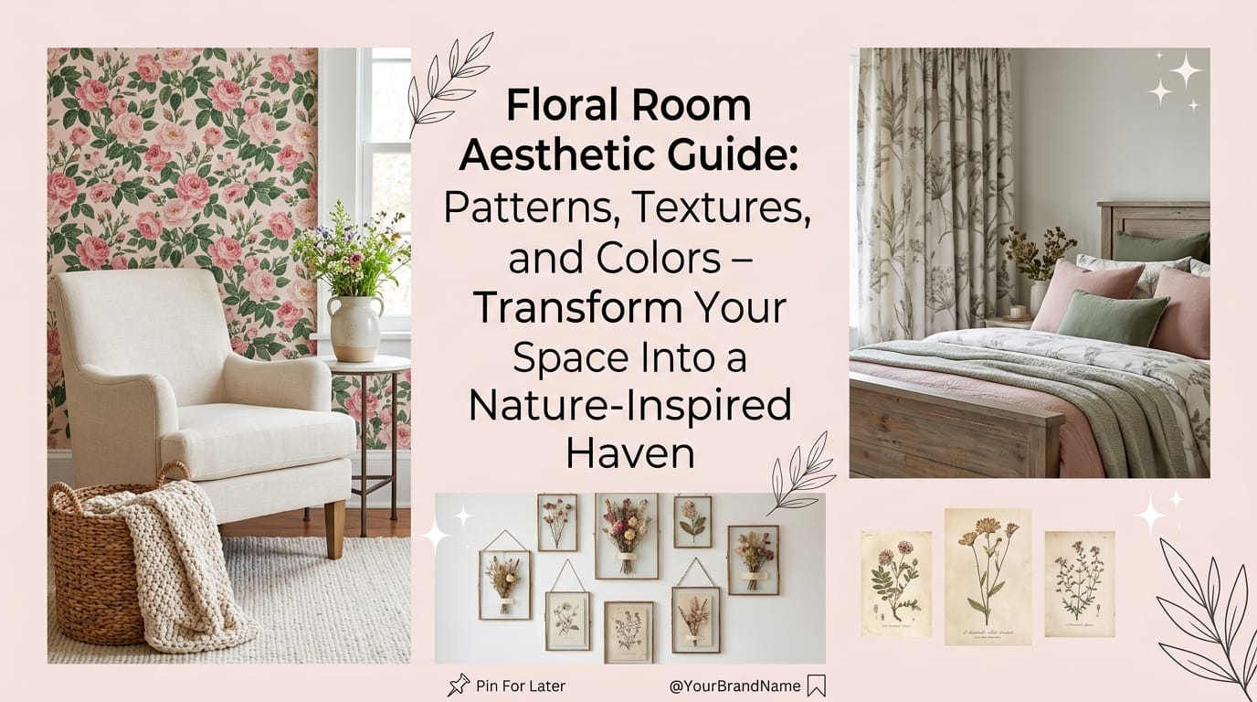
Ever walked into a room and felt an instant wave of calm wash over you? That’s probably because florals were doing the heavy lifting. I’m obsessed with how a well-designed floral room can completely transform a space from “meh” to absolutely stunning. Whether you’re going for soft, romantic vibes or bold, dramatic energy, this guide will walk you through everything you need to know about creating a floral room that actually works.
The secret? It’s not just slapping a floral wallpaper on your walls and calling it a day. Real floral room design hinges on balancing patterns, textures, and colors in ways that make your space feel intentional and layered. Let me break down exactly how to pull this off.
Understanding the Core Elements of Floral Room Aesthetics
So here’s the thing about floral design—it’s way more nuanced than people realize. You’ve got three main players working together: the patterns you choose, the textures you layer, and the colors that tie everything together. Get all three right, and your room becomes this multi-dimensional masterpiece. Miss one, and you end up with visual chaos 🙂
The foundation of a killer floral room comes down to understanding how these elements interact. Think of your background color as the stage, your floral pattern as the main actor, and your textures as the lighting and set design. Each plays a crucial role in the overall vibe.
The Balance Between Pattern and Background
Here’s something designers don’t always talk about openly—your background color matters just as much as (if not more than) your actual floral pattern. I know that sounds wild, but stick with me.
When your background takes up the majority of visual space, it becomes the dominant force that sets your room’s mood. Your florals? They essentially become a secondary element—almost like a texture. This is why a purple room with sparse florals reads completely differently from a room where ivory dominates with bold purple flowers. The psychology shifts entirely.
The key insight here is understanding sparse florals on bold backgrounds create one effect, while dense patterns on muted backgrounds create another. This distinction alone can make or break your design.
Mastering Floral Patterns: The Game Changer
Choosing the right floral pattern is like picking the outfit for your room’s entire personality. FYI, scale and style matter way more than people think.
Pattern Scale and Its Impact
Let me be real with you—small, delicate florals and large-scale bold patterns are basically two different design languages.
Small-scale florals (think delicate roses, violets, and peonies) absolutely nail the cozy, vintage aesthetic. They work beautifully in bedrooms and powder rooms, giving you that nostalgic cottage-core energy. These patterns make tight spaces feel intentional rather than cramped.
Large-scale florals, on the other hand, demand attention and make a statement. They work brilliantly on living room walls or as upholstery on statement furniture pieces. They’re modern, confident, and impossible to ignore.
Here’s a breakdown of pattern styles you should actually consider:
| Pattern Type | Vibe | Best Rooms | Color Examples |
|---|---|---|---|
| Soft Vintage Florals | Nostalgic, calming, intimate | Bedrooms, powder rooms, nurseries | Blush pink, pale blue, ivory, cream |
| Botanical/Earthy | Natural, grounded, sophisticated | Living rooms, studies, retreats | Sage green, soft yellow, dusty blue |
| Watercolor Florals | Dreamy, ethereal, artistic | Bedrooms, creative spaces | Pastel pinks, lilacs, soft blues |
| Dark Dramatic Florals | Moody, luxe, bold | Dining rooms, accent walls | Navy, black, charcoal with jewel tones |
| Large-Scale Contemporary | Modern, energetic, gallery-like | Boho spaces, lofts, feature walls | Mixed vibrant tones, earth colors |
Mixing Patterns Without Creating Visual Chaos
Ever wondered why some rooms with multiple patterns look like a curated magazine spread while others look like a pattern explosion happened? It’s all about restraint and cohesion.
Stick to 2-3 patterns maximum in your room, and here’s the pro move—pair large florals with small geometrics or solid textures. This creates visual breathing room. If you’re using bold florals on your wallpaper, keep your upholstery more minimal or use a coordinating solid color. Save the pattern-on-pattern combinations for smaller accent pieces like throw pillows or artwork.
The color story ties everything together. When all your patterns share a consistent palette, even if they’re different styles, they feel intentional rather than random.
Textures: The Secret Weapon Nobody Talks About
Okay, this is where things get really fun. Textures are honestly the MVP of floral design, and I genuinely think designers should talk about this more.
Building Contrast for Visual Depth
Texture contrast literally doubles your room’s visual interest. I’m not exaggerating—layering different textures transforms flat florals into something you actually want to touch and experience.
The magic happens when you combine:
- Soft elements (velvety roses, fluffy hydrangeas, mohair velvet upholstery)
- Rough elements (spiky thistles, dried grasses, coarse-weave rugs)
- Glossy elements (orchids, polished leaves, silk throws)
- Matte elements (ferns, feathery foliage, cotton textiles)
This isn’t just visual theater—it genuinely affects how people perceive and interact with your space. A room with textural contrast feels more luxe, more intentional, and honestly more interesting.
Applying Textures in Actual Rooms
Here’s how you actually implement this without overthinking it:
Start with your foundational soft elements—your main floral piece (wallpaper, upholstery, or artwork). Then layer in contrasting textures through secondary pieces. Add a seagrass rug, some dried grasses in a vase, rough linen curtains, or a velvet throw. Each element doesn’t need to scream, but together they create this gorgeous depth.
For fall aesthetics specifically, designers are leaning into grasses, dried pods, and natural fillers alongside florals. This combination creates seasonal interest while maintaining that sophisticated floral foundation.
Color Palettes: Setting the Emotional Tone
Colors do the heavy lifting when it comes to setting your room’s vibe. This is non-negotiable. Get your colors right, and everything else falls into place.
The Foundation: Choosing Your Base Palette
Here’s my personal take—your background color matters more than your floral color. I know that contradicts what most people think, but it’s true.
When you’re selecting colors, understand that saturated, bold backgrounds create drama and energy, while muted, receding colors create calm and sophistication. A dusty blue backdrop with sparse florals reads completely different from a bright white backdrop with the same flowers.
Palettes That Actually Work
Pastel Calming Palette: Blush pink, lavender, sage green, pale blue. This combo screams serenity. Pair it with watercolor florals on your walls and soft, flowing textiles. Your room becomes this peaceful sanctuary you never want to leave.
Earthy Natural Palette: Sage green, soft yellow, dusty blue—basically nature’s color story. This works in literally any room because it’s so universally soothing. Add living plants to reinforce the natural connection, and you’ve got something special.
Bold Modern Palette: Jewel tones (emerald, sapphire, amethyst) on navy or black backgrounds. This isn’t subtle, and that’s the whole point. Pair it with contemporary furniture and matte black fixtures, and your room becomes a gallery-worthy statement.
Monochrome Subtle Palette: Black, white, and sepia tones in floral patterns. Here’s the sneaky genius of this approach—it works in rooms with literally any other color because it’s neutral. Your colorful furniture becomes the main character while florals add sophisticated texture.
Real-World Inspirations: These Designers Actually Nailed It
Let me walk you through some real examples that genuinely prove this stuff works.
Purple Field Bedroom Design
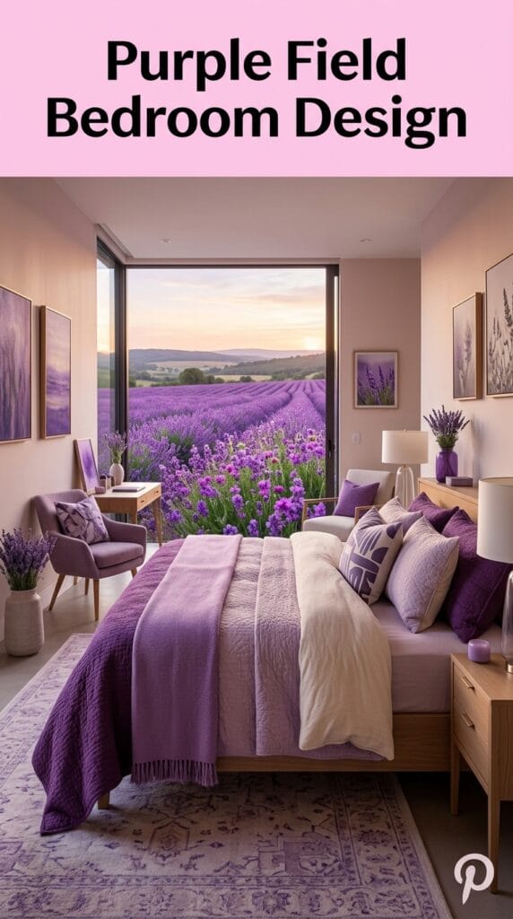
Picture this: a bold purple field with sparse florals scattered across it. The purple dominates the visual space, making the flowers feel like intentional texture rather than pattern. Pair this with modern, minimalist furniture, and you’ve created something that feels both sophisticated and current. The key here? The bold background color sets the entire mood, and the designer knew exactly what they were doing.
Austin Living Room: Tradition Meets Modern
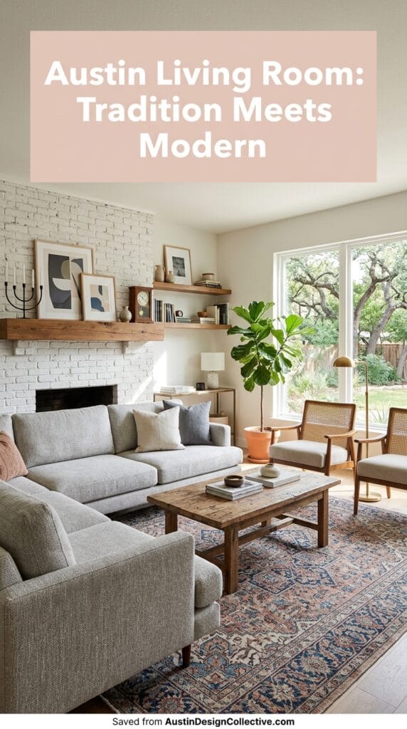
Here’s where traditional florals meet contemporary furniture, and somehow it creates this dynamic energy nobody expects. Large-scale floral patterns on modern upholstery create intentional tension—it works because the contradiction is deliberate. The vintage pattern says “comfort,” the modern furniture says “style,” and together they create something genuinely interesting.
Botanical Green Accent Wall
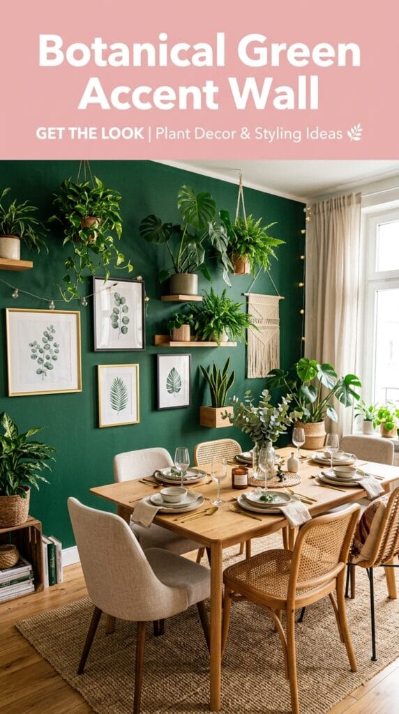
Dark forest green with realistic botanical florals might sound heavy, but it’s absolutely stunning. This approach brings elegance and subtle energy to a space. When you use darker background colors, make sure your furniture is lighter or your lighting highlights the space—otherwise you risk feeling like you’re in a cave (and not the cozy kind).
Oversized Watercolor Florals
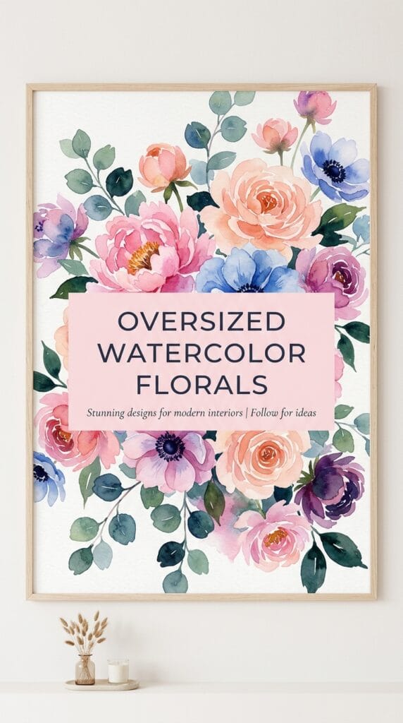
Large-scale watercolor designs in soft, bold-yet-gentle hues fill spaces with subtle power. These work particularly well in bedrooms and creative spaces where you want beauty without aggression. The watercolor effect softens what could be an intense pattern, making it feel more dreamlike.
Step-by-Step: How to Actually Create Your Floral Room
So you’re sold on the concept, but where do you actually start? Let me give you the actionable steps.
Step One: Assess Your Space
Measure your room. Seriously. Are you working with a small bedroom or a sprawling living room? Small spaces benefit from small-scale patterns and lighter colors. Large spaces can handle oversized florals and bolder palettes.
Also consider your lighting. Natural light completely changes how colors read in a space. A soft pink might look rosy in morning light and almost coral in afternoon light.
Step Two: Choose Your Hero Elements
Pick your main floral piece first—this is usually your wallpaper or statement upholstery. This becomes the anchor everything else builds around. Everything else is supporting cast.
Step Three: Layer Your Textures
Once you’ve got your pattern locked in, layer contrasting textures. If your main pattern is smooth and refined, add rough elements. If it’s delicate, add some glossy shine. This is where your room transforms from nice to genuinely interesting.
Step Four: Introduce Textures Through Textiles and Accessories
Throw pillows, curtains, area rugs, and throws are your secret weapons. These let you experiment with textures without making permanent changes. A chunky knit throw or a velvet pillow can completely shift your room’s tactile story.
Step Five: Balance with Neutrals and Modern Elements
Here’s the move nobody expects—balance your florals with contemporary, minimalist furniture. This prevents your room from feeling like a floral explosion. Modern furniture grounds floral patterns and keeps everything feeling intentional rather than chaotic.
Common Mistakes to Actually Avoid
Over-patterning: Limit yourself to 3 patterns maximum, and make sure they share a consistent color story. Your room will thank you.
Ignoring scale: Don’t put oversized florals in a tiny room, and don’t use small, fussy patterns on large walls. Match your scale to your space.
Forgetting about the background: This cannot be overstated. Choose your background color as carefully as you choose your pattern.
Skipping texture entirely: A room with pattern but no texture feels flat and unfinished. Texture is what makes it real.
The Practical Truth: What Actually Works in Different Room Types
Bedrooms: Comfort Meets Serenity
Bedrooms are your personal sanctuary, so lean into softer florals and calming color palettes. Watercolor patterns in pastels are absolute magic here. Layer with soft, luxe textiles—think high-quality linens, velvet pillows, and a chunky knit throw at the foot of your bed.
Living Rooms: Making a Statement
Living rooms are where you can get bolder. Large-scale florals work beautifully here, especially in jewel tones or on dark backgrounds. This is also where you can mix pattern and texture more dramatically because you have the space to breathe.
Bathrooms and Powder Rooms: Delicate Details
Small spaces are perfect for small-scale, vintage florals. A powder room with delicate roses and a soft pink palette becomes this charming, Instagram-worthy space that your guests will remember. The small scale feels intentional rather than cramped.
Home Offices: Inspired and Focused
Botanical florals in earthy tones create a grounding, inspiring workspace without being distracting. You want something that soothes rather than overwhelms when you’re trying to focus.
FAQs: The Questions Everyone Actually Asks
Best starter floral wallpaper?
Honestly? Go with an earthy botanical in muted tones. You literally cannot go wrong. It works in any style, with any furniture, and it photographs beautifully.
How do I mix textures without my room looking chaotic?
Start with two to three contrasts maximum. Soft + rough + glossy is your sweet spot. Any more than that feels overwhelming.
What if I’m scared of bold colors?
Start with muted versions of colors you love. Dusty sage instead of bright green. Soft blush instead of hot pink. You get the color story without the intimidation factor.
Can I use florals in a minimalist space?
Absolutely. Use large-scale florals with tons of negative space, minimal patterns, and contemporary furniture. The contrast is actually really striking.
How do I prevent my floral room from feeling dated?
Mix your vintage florals with modern furniture and accessories. This tension keeps everything feeling current. Also rotate in fresh seasonal accents—this keeps things from feeling stuck in time.
The Final Word: Your Floral Room Awaits
Here’s what I genuinely believe—floral rooms work because they tap into something fundamental in how we respond to beauty and nature. When you nail the balance between pattern, texture, and color, you create spaces that feel both sophisticated and genuinely comforting.
Start with one element—maybe it’s a wallpaper, maybe it’s a piece of upholstery. Let that be your north star, then build everything else around it with intention. Layer your textures, choose colors that feel right to you, and don’t overthink it.
Your room has so much potential. Now go make it bloom 🙂