You know that moment when your bedroom should feel cozy… but it somehow feels like a random hotel room met a clearance aisle? Yeah. That usually comes down to color—and not in a dramatic “paint fixes everything” way (although… it kind of does).
I’ve repainted bedrooms more times than I’d like to admit, and I learned one thing the hard way: the “perfect” bedroom color palette isn’t a single paint color. It’s paint + textiles + lighting + a tiny bit of self-control. So let’s build you a palette that feels calm, looks intentional, and doesn’t make you regret your choices at 2 a.m.
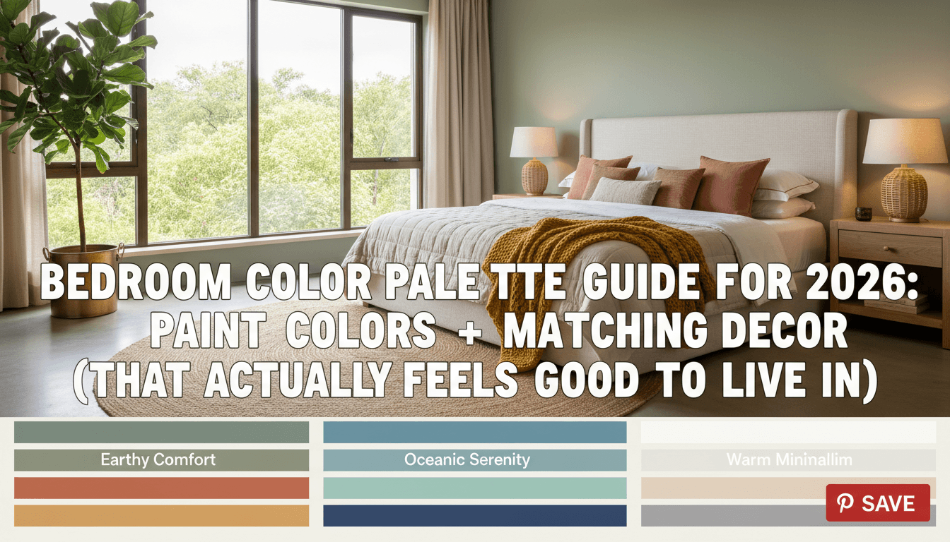
Quick-Start: 5 Bedroom Color Palettes That Nail Calm + Cozy Fast
Want results without spiraling into 87 sample swatches? Start here. These palettes line up with what major paint brands and interior design publications keep pushing for 2026: warm neutrals, earthy greens, soft blues, and moody jewel tones—aka colors that feel comforting instead of shouty.
1) The “Neutral Haven” Palette (Beige, Taupe, Cream, Soft Gray)
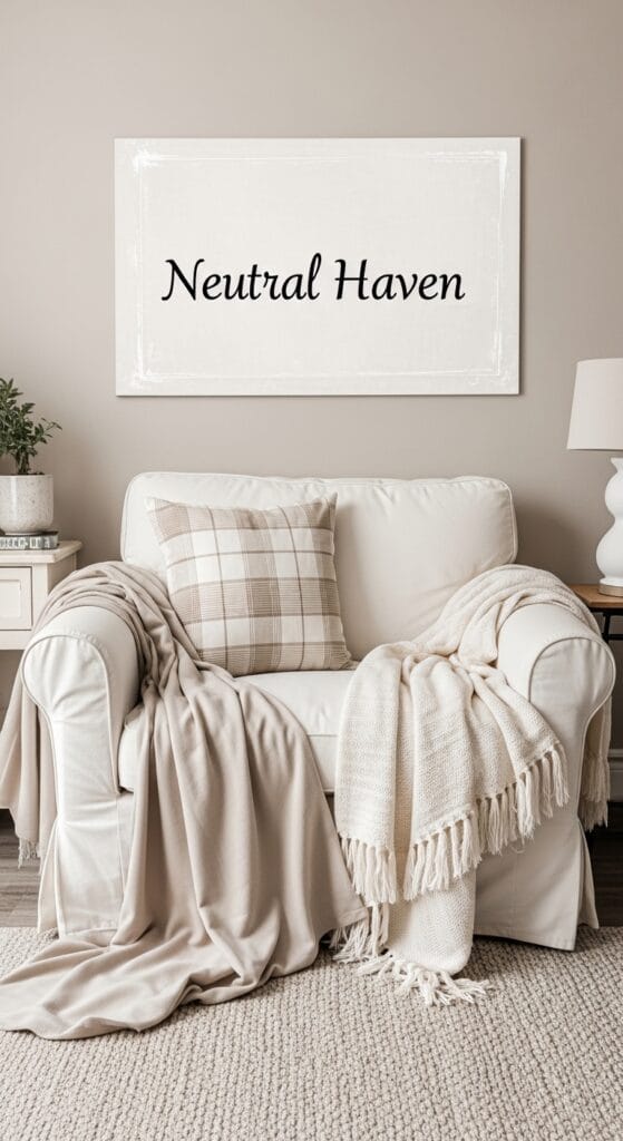
If you want your bedroom to feel like a deep breath, neutrals handle that job.
How to use it (60-30-10 rule):
- 60%: warm off-white or light taupe on walls
- 30%: bedding + rugs in oatmeal, greige, or soft gray
- 10%: black accents (frames, lamp base, hardware) for contrast
Why it works: neutrals make everything else look expensive—even when it’s not.
2) The “Sage Retreat” Palette (Sage Green + White + Natural Wood)
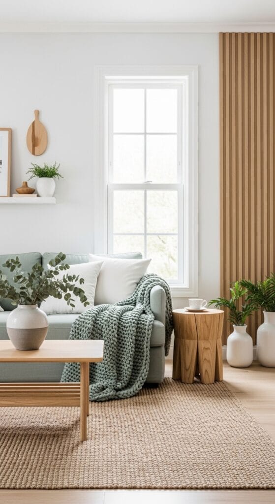
Sage green keeps trending because it looks fresh, it feels grounded, and it plays nice with wood tones.
Try paint shades in the sage / eucalyptus / olive-mist family. If you want specific brand starting points, you can sample:
- Sherwin-Williams Evergreen Fog (soft sage-gray vibe)
- Benjamin Moore October Mist (gentle, airy green)
Decor combo I always love: white linen bedding + oak furniture + a plant you actually water.
3) The “Soft Blue Sleep Mode” Palette (Powder Blue + Warm White + Sand)
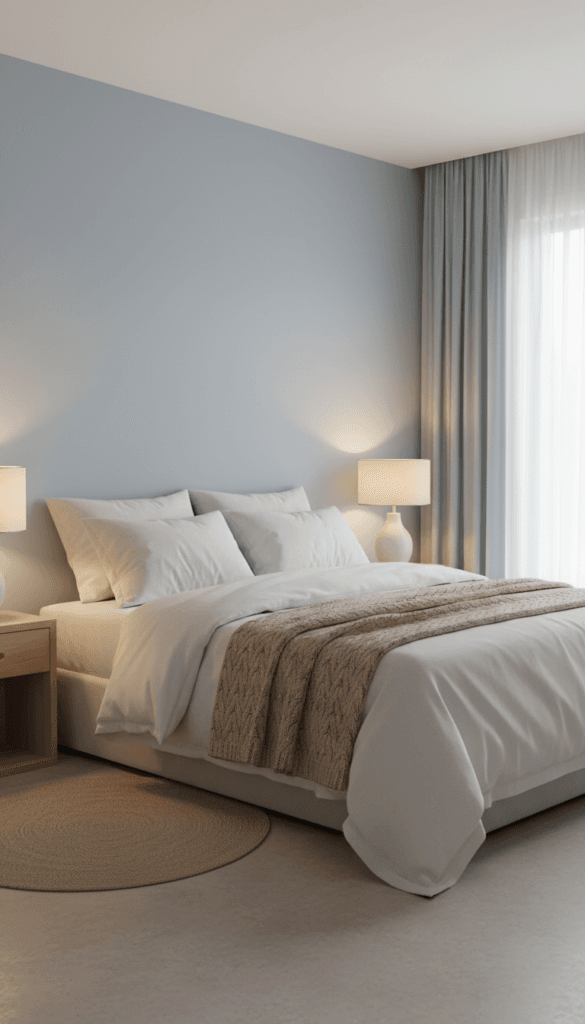
Ever wonder why beachy bedrooms feel so restful? Soft blues pull that trick off fast.
Go for dusty sky blue or gray-blue instead of bright “kid’s room” blue. Add warmth with creamy whites and sandy textures so the room doesn’t feel cold.
4) The “Burgundy Glow” Palette (Muted Burgundy + Beige + Brass)
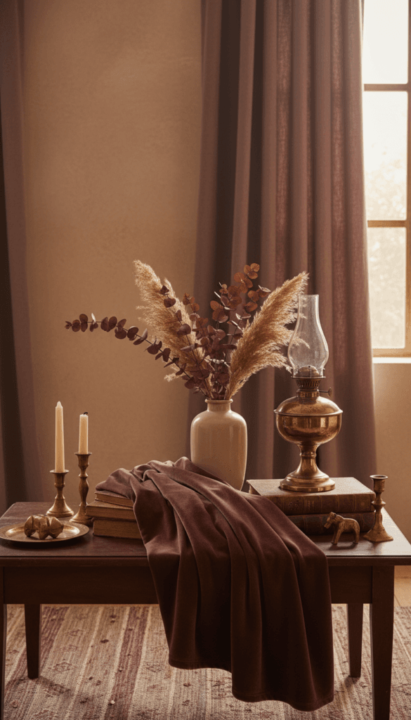
Burgundy brings drama, but you need to keep it on a leash. Use it like hot sauce, not soup.
Best use: one accent wall, or pillows + a throw + art that echoes the tone. Pair with beige, camel, and brass to keep it cozy instead of intense.
5) The “Dark Teal Cozy Cave” Palette (Deep Teal + Soft Gray + White)
Dark teal makes a bedroom feel like a boutique hotel—without the “why is the lighting so weird” part.
Use teal on all walls for full mood, then lighten the room with:
- white ceiling + trim
- pale gray bedding
- warm wood nightstands
FYI, this palette looks wildly good with velvet textures if you want instant luxury.
Why Bedroom Colors Matter More Than You Think (Mood, Sleep, and Space)
I know, I know. It’s “just paint.” But color controls the vibe faster than furniture ever will.
Color affects how you feel in the room
You don’t need a psychology degree to notice patterns:
- Soft blues and greens feel calmer and quieter.
- Warm neutrals feel cozy and safe.
- Super-bright reds and neons feel energizing… which sounds fun until you want to sleep.
So ask yourself: Do I want my bedroom to energize me, or knock me out like a lullaby?
Light changes everything (and it loves to mess with you)
Paint shifts all day long. Morning light makes colors look crisp. Evening light makes them warmer. Cloudy days make them moodier.
So before you commit, test paint in:
- morning sunlight
- afternoon light
- nighttime lamp light
Yes, it sounds annoying. Yes, it saves you from repainting. 🙂
Color can “resize” a room
Want a small room to feel bigger?
- pick lighter wall colors
- keep contrast low (soft trim, not harsh bright white)
Want a big room to feel cozy?
- go deeper (teal, charcoal, earthy brown)
- add layered textiles to bring warmth in
Choose Your Perfect Bedroom Palette (Without Overthinking It)
You can absolutely wing it… but you’ll probably repaint. I prefer a simple system that keeps you sane.
Step 1: Pick the mood first
Ask: What do I want to feel when I walk in?
Choose one:
- Calm + airy → soft blue, pale green, creamy white
- Cozy + warm → beige, taupe, terracotta, muted burgundy
- Moody + luxe → deep teal, charcoal, inky navy
Step 2: Use the 60-30-10 rule (it works because it limits chaos)
This rule keeps your room from looking like a Pinterest board exploded.
- 60% = walls (main paint color)
- 30% = big fabric + furniture (bedding, rug, curtains, headboard)
- 10% = accents (art, pillows, lamps, hardware)
Step 3: Decide your contrast level
If you want a peaceful room, keep contrast gentle. If you want a bold room, add contrast intentionally.
- Low contrast: cream + oatmeal + warm wood
- Medium contrast: sage + white + walnut
- High contrast: deep teal + white + black accents
Step 4: Pick 2–3 textures to make the palette feel real
Color looks flat without texture. Texture gives your palette depth.
My favorites:
- linen (casual, breathable)
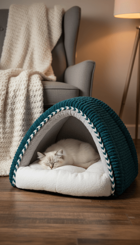
- velvet (moody, plush)
- woven jute/wool (warm, grounded)
Best Bedroom Paint Shades + Application Tips (So You Don’t Regret It)
Paint brands keep highlighting similar families for current trends: earthy greens, warm whites, clay neutrals, and deep jewel tones. You can get that look in any brand, but these well-known shades give you a reliable starting point:
Brand shade ideas (easy jumping-off points)
- Benjamin Moore: White Dove (warm white), October Mist (soft green)
- Sherwin-Williams: Alabaster (warm white), Evergreen Fog (sage-gray)
- Behr: Blank Canvas (warm neutral), soft blue-greens in their coastal palettes
- Valspar: Swiss Coffee (warm neutral), muted blue-greens like Renew Blue
Where to put what (so the room looks designed)
- Put your main color on the largest wall surfaces.
- Use an accent wall when you want drama without cave-level darkness.
- Paint trim and ceiling in a softer white when you choose warm walls (stark white can look harsh).
Palette table: pick your vibe in 10 seconds
| Palette Name | Wall Color Direction | Best Decor Matches | Best For |
|---|---|---|---|
| Neutral Haven | warm white, beige, greige | oak, linen, black accents | small rooms, easy styling |
| Sage Retreat | sage, eucalyptus, olive-mist | plants, rattan, white bedding | natural light, calm mood |
| Soft Blue Sleep Mode | powder blue, gray-blue | warm whites, sandy textures | stress relief, airy feel |
| Burgundy Glow | muted burgundy, wine | brass, cream textiles, walnut | cozy drama, accent walls |
| Dark Teal Cozy Cave | deep teal, blue-green | velvet, white trim, warm wood | hotel vibe, big rooms |
Matching Decor to Your Paint (So It Looks Intentional, Not Accidental)
Paint sets the stage. Decor makes the palette feel finished.
Neutrals: make it feel rich, not bland
Neutrals can look “builder basic” if you skip texture.
Use:
- nubby throws and woven blankets
- warm wood furniture
- layered rugs (or one thick one)
- black accents for structure
Sage green: keep it earthy and light
Sage looks best when you reinforce the nature vibe.
Pair it with:
- light oak or walnut
- off-white bedding
- brass or matte black hardware
- pottery, linen, and soft art
Soft blues: add warmth so it doesn’t feel chilly
Blue can drift cold fast, especially in north-facing rooms.
Warm it up with:
- cream curtains
- beige rugs
- soft amber lighting
- wood tones instead of gray wood
Burgundy and teal: balance bold with calm
These colors look amazing… and they also overpower a room if you treat them like neutrals (they’re not).
Keep the room grounded with:
- neutral bedding
- simple curtains
- a limited accent palette (2 metals max)
IMO, one bold color looks more expensive than five bold colors fighting to the death.
Color Psychology for Sleep (Yes, It Matters)
You don’t need to optimize your life like a robot, but you do want your bedroom to help you unwind.
If you want calm and quiet
Pick:
- soft blue
- muted green
- warm off-white
Then avoid high-contrast patterns everywhere. Let your eyes rest.
If you want cozy and cocoon-like
Pick:
- taupe
- warm beige
- muted terracotta
- burgundy accents
Then add texture: thick bedding, soft rugs, layered lighting.
If you want moody and romantic
Pick:
- deep teal
- charcoal
- navy
Then commit to warm lighting. A moody paint color with cold bulbs feels… haunted. :/
Common Bedroom Color Mistakes (And Easy Fixes)
You can fix most bedroom palette problems without repainting the whole room.
Mistake 1: You pick a bold wall color and panic later
Fix: keep the wall, swap textiles to neutrals, and limit accents to one or two colors.
Mistake 2: You forget lighting exists
Fix: test swatches and upgrade bulbs. Warm bulbs instantly soften harsh colors.
Mistake 3: You mix undertones (and the room feels “off”)
Warm paint + cool gray bedding often clashes.
Fix: match undertones:
- warm walls → cream, camel, warm woods
- cool walls → crisp whites, charcoal, cooler woods
Mistake 4: You buy “random cute things” and call it decor
I love a good impulse buy, but the room needs repetition.
Fix: echo your palette in 3–5 items (pillows, art, rug, throw, lamp). Your brain reads that repetition as “cohesive.”
Tools + Next Steps: Paint Smarter This Weekend
You don’t need a full renovation. You need a plan and a sample pot.
My simple weekend plan
- Pick one palette from the table above.
- Buy 2–3 sample pots (or peel-and-stick samples).
- Test them on 2 walls and check them at 3 times of day.
- Choose your main wall color, then pick bedding and accents with the 60-30-10 rule.
Handy tools that help (without overcomplicating things)
- online palette generators (great for accent planning)
- paint brand visualizers (helpful for imagining full walls)
- bulb color temperature check (warm lighting saves moody palettes)
Final Take: Pick the Palette That Helps You Exhale
If you remember one thing, remember this: your bedroom color palette needs to support sleep and comfort first, and trends second. Start with a mood, follow the 60-30-10 rule, and use texture to keep the room from looking flat.
Now tell me—do you want your bedroom to feel like a bright, airy reset… or a cozy cave you never leave? Either way, grab a couple samples and make it happen. Your future self (the one who actually sleeps) will thank you.